User interface directional cues may be either implicit or explicit – obvious like arrows or subtle things like white space that the brain picks up on subconsciously. Knowing when to use them and which ones to use is crucial to building a positive user experience.
Overview
Implicit Directional Cues
Implicit cues are the ones that users don’t often notice. Familiar implicit directional cues include:
Color and Contrast
The color itself plays a significant role in how users respond to your content. Color theory indicates that each shade can evoke emotion and has strong psychological associations. Therefore, it’s essential to take time to match your color choices to the message you’re trying to send to site visitors.
- Red: This primary color is associated with anger, danger, heat, passion, love, and sexuality.
- Orange: This secondary color mixes equal parts red and yellow, and therefore shares qualities of both colors. It combines the warmth of red when the optimism of yellow to promote socialization and stimulate the appetite.
- Yellow: As a primary color, it is the most visible color from a distance, so it’s often used as a cautionary color. Yellow is playful, happy, and is often associated with intellect, optimism, and mental clarity.
- Green: This secondary color is the result of mixing equal parts blue and yellow, thereby sharing characteristics of both colors. Green is associated with both nature and money. With natural associations, it represents growth, rebirth, and renewal. With monetary associations, it represents greed, wealth, and prestige.
- Blue: This primary color is associated with business, nature, royalty, military, trust, and more. Studies show blue is a favorite color across the globe. It evokes calmness and tranquility.
- Indigo: Indigo is associated with higher knowledge, intuition, wisdom, devotion, justice, and spirituality.
- Violet: Violet is associated with a feeling of intelligence and confidence like blue, but it is also associated with individuality and creativity.
- Pink: As a mixture of red and white, pink is associated with romance, femininity, sensitivity, and sweetness. Certain shades can be energetic.
- White: White is a color without a hue and is the symbolic opposite of black. In Western culture, white symbolizes purity and innocence, whereas, in Asian culture, it is the color of grief, mourning, and loss.
- Black: This is the darkest color because it completely absorbs light. It is similar to white because it is also a color without a hue. Black is associated with evil, sadness, darkness, and mourning, but in ancient Egypt, the color had a positive association of protection and fertility. Today, it is becoming a symbol of elegance and simplicity.
- Grey: As a mixture of black and white, it is both versatile and timeless. As a neutral color, it can be combined with nearly any other color in the spectrum. Though it isn’t the cheeriest color, it can create a contemporary and sophisticated feel. When used with white and black, it creates a serious feel.
- Brown: Creating brown must occur through a mixture of red black and yellow or red and green depending on which color system you’re using. Surveys indicate that most people dislike brown. The warmth of brown is associated with strength, healing, and reliability. Brown pairs well with nearly every color because of its prominence in nature.
Research has shown that light and color have a specific physiological mechanism that can affect impulsivity, alertness, heart rate, mood, and more.
Need help choosing the right colors for your landing page? With this tool, you can choose one color, then a color combination (complementary, monochromatic, etc.) to generate a palette to work from.
But beyond the colors you choose, the contrast between them matters, too. Stark differences in color drive visitor attention to certain areas of the interface. The contrasting colors also affect readability, which is vital for the overall experience.
White Space
This is the empty area or negative space of your pages. Keeping plenty of white space helps draw attention to specific elements and keeps the page simple and makes it easier for visitors to understand your offer. With fewer components to focus on, visitors have no choice but to look where you want them to.
Encapsulation
Encapsulation refers to how objects are framed. It highlights what’s important on a page by creating a window of focus with boxes, outlines, and contrasting colors. This helps to reduce clutter on the page while also drawing attention to specific elements.
Visual Weighting
Visual weight is the concept that design elements have varied weights. Even in a two-dimensional medium, some objects appear to be heavier than others. This concept allows designers to create visual hierarchy along with harmony, symmetry, and balance in their designs. When strategically used, visual weight can help guide a viewer’s attention to the places we want in a design, making it a rather subtle directional cue.
Sometimes, visual weight is evident because larger objects appear heavier than smaller ones simply because they occupy more space. Color can also influence visual weighting, as can size, shape, proportion, density, and complexity.
Explicit Directional Cues
Explicit directional cues are more obvious to the human eye, making them easier to spot. They include:
Eye Tracking
Also known as eye gaze, eye tracking measures the eye’s motion as a user views a web page or measures where the eye is focused. When website visitors are connected to eye-tracking software, it’s possible to learn:
- How the size and placement of objects on your existing site or proposed design changes affect attention
- Where visitors are looking
- The parts of the user interface that you miss
- How their focus moves from object to object on a web page
- How they are navigating the length of the page
Knowing the path of eye gaze helps ensure you guide user attention to the areas where you want the most focus.
This is where using heat maps can be highly beneficial. Also known as a scroll map, this technology is excellent at showing where the most substantial drop off points on a page are located. Heatmaps use a light-to-dark color range to show you the parts of a web page that are getting the most attention. They are based on which sections of the page get more clicks.
The higher activity levels get a dark color, and the lower levels get a light color. You can also use them for scrolling to see how far down your scroll on your website. Confetti and maps are also available to help you learn about the clicks from different segments of viewers, such as where the clicks are coming from or what referral source is bringing them to your website.
Arrows
Arrows are one of the most commonly used directional cues because they are easy to understand and straightforward. Sometimes, you’ll see moving arrows, but stationary ones are effective as well. Arrows are placed to help users navigate below the fold.
Object Positioning
With object positioning, designers position images and video, so they’re pointed toward a particular Focus area to draw user attention and make that element more noticeable.
Lines
Humans tend to follow a path naturally, so using lines can be helpful on landing pages. Linear directional cues guide visitors through various parts of your page and help prospects stay focused on certain sections of your page.
Gesturing or Pointing
Though this technique isn’t as subtle as using eye gaze, some opt to have a model point or gesture toward a critical element to get visitors to focus on that area. There’s always a chance the gesture may appear unnatural, so it’s crucial to split test your pages with different gestures to determine what provides the best results.
How User Interface Directional Cues Influence User Experience
Directional cues:
- Make it easier to navigate around a website.
- Improve visual hierarchy
- Ensure the screen or page is scannable.
- Improve conversion rates
Though your copy, form, headline, and call to action (CTA) are indeed crucial for driving conversions, these elements only make up a portion of the user experience. Adding directional cues, both implicit and explicit, helps to ensure your prospects focus their attention on what matters most to your conversion goal.
Did you know it takes only 1/10th of a second to form a first impression of another individual? Websites are no different. It only takes about 50 milliseconds (.05 seconds) for a user to judge a site and determine whether they like it enough to stay.
That first impression, according to British researchers, is 94% design related. It depends on many factors, including structure, symmetry, colors, spacing, the amounts of texts, fonts, and more. The look and feel of a website is the primary driver of the first impression. Website navigation and visual appeal have the most significant influence on people’s first impressions of a website.
Another study conducted by Stanford University credibility experts, similar results were found. The study indicated that what people say about how they evaluate a website’s trust and how they really do it are different.
The data showed that the average consumer paid far more attention to the superficial aspects of a website, such as visual cues than to its content. Nearly half of the consumers in the study assessed website credibility based in part on the appeal of the overall visual design or user interface.
People are information foragers, and as we look for relevant information, we rely on familiar cute, and icons to direct our path. We process visual stimuli with our past experiences and mental shortcuts known as heuristics to form our visual perception.
As a result, when you perceive a landing page elements such as a CTA or arrow, you process the element via your past experiences. A pointing arrow is generally a cue to direct your attention towards something, and that translates online as well.
The important thing to remember when it comes to directional cues and user interfaces is it visual processing is complicated. It is possible to overdo it on the directional cues, and this is a situation where more is not necessarily better.
If your images or visual cues are irrelevant or distracting from the primary purpose of the page, they can damage conversion. Because of this, it’s important to consider how images reinforce or distract from your value proposition as you’re choosing photos. For instance, if your value proposition is around emotions, using faces could work well. If not, it may be better to use an informational graphic or products.
Directional cues are crucial to effective design. But, as with many things related to the user experience and conversion rate optimization, it is a mixture of both art and science. While there is a lot of creativity that goes into effective page design, it is crucial to test it all for yourself because no two audiences are exactly the same, and they don’t necessarily respond in the same way.

OTHER ARTICLES YOU MIGHT BE INTERESTED IN

AI in Addiction Marketing: Leveraging Automation and Data-Driven Personalization

Beyond the 'Call Now' Ad: Using Funnel-Based Messaging to Nurture Drug Rehab PPC Leads

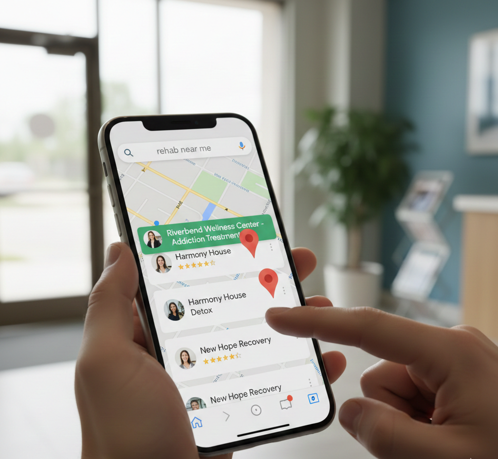
Winning the Local Search War: How to Master Google's Map Pack for Rehab Admissions
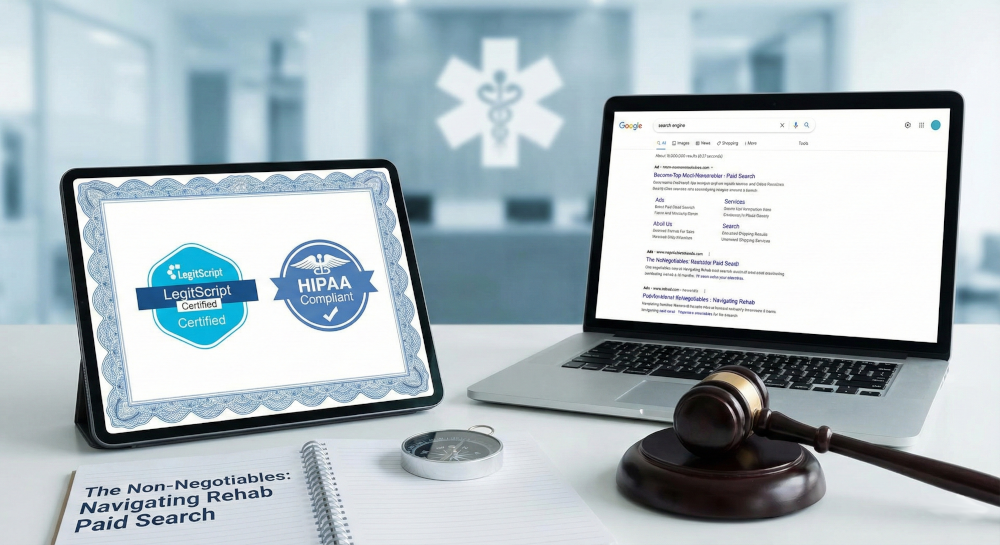
The Non-Negotiables: Navigating LegitScript and HIPAA Compliance for Drug Rehab Paid Search
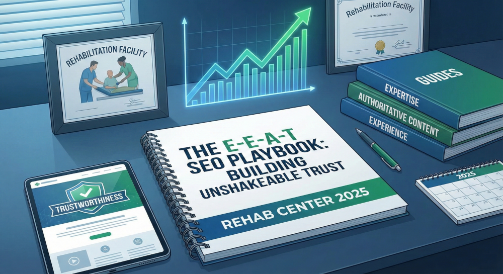
The E-E-A-T SEO Playbook: Building Unshakeable Trust for Your Rehab Center in 2025

Beyond the Bed Count: Marketing Client-Centered and Trauma-Informed Care

Contact us today to get the conversation started!