Looking at your website analytics, you see there’s plenty of traffic coming in, but that nice chunk of traffic isn’t showing in your conversions.
What is the problem? Chances are, it’s the most important element of your site – your call to actions (CTAs) are the offender.
The good news is, you don’t need some magic spell to make your visitors convert. All it takes is applying some basic principles, testing the results, and then refining according to what works best.
Take a look at these strategies to help you increase your conversion rate.
Overview
CTA Strategy #1: Follow the KISS Principle
KISS stands for Keep it Simple, Sweetie. When you give visitors too many choices, you overwhelm them, which in turn kills your conversion rate. The more choices a visitor has, the higher chance they have of becoming distracted and moving away from the action you want them to take. By simplifying everything, you make it easier for people to see how to take action.
Ways to simplify the CTAs on your site include:
- Removing navigation menus from the landing page.
- Including a single CTA.
- Making the CTA Clear – using copy and layout.
CTA Strategy #2: Personalize Your CTAs
At this point, you’re driving plenty of traffic. You’ve simplified the landing page and you have clear CTAs. What else can you do to boost your conversion rates?
You can personalize your CTA button text. Rather than “free download” for your free report, you can change it to something like: “Show me how to….” where the text after “how to” refers to the content of your report.
So, how can you do it? Think about your target clients. Think about the value that your download or product offers the audience.
To personalize your CTA:
- Focus on the value you’re offering customers. What’s in it for them?
- Tie the unique selling point to that value.
- Tell your site visitors why they should want to take the action you’re trying to get them to take.
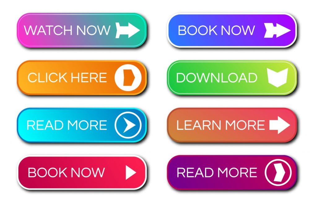
CTA Strategy #3: Use Color
Before your audience can convert, you must have their attention. Tell the audience where you want their eyes to go by using a powerful CTA – in terms of colors, shadows, gradients, fonts, and kerning.
Ultimately, there’s no single answer as to the best color you should use for your CTA button. One thing we do know for sure is that you should not use black, white, gray, or any muted color. Why? Because these are not bright enough. They don’t stand out from the background, and won’t grab attention. If you’re not careful, the use of color in your landing page may even steer the vistor’s eyes away from the CTA.
So how can you decide the best color to use for your CTA button? Much of your decision should be based on the current branding and colors you’re using. It must be a color that stands out from the background, but doesn’t clash with it, and it should grab attention.
If you want to see if a certain color grabs attention, use a tool like ButtonOptimizer to create multiple buttons. You’ll use the glance test to see which one grabs your attention.
Once you’ve created all the buttons, lay them all out and look at them for a second, then see which one is most noticeable.
It may seem like hype, but studies show color influences everything from how we perceive the ambient temperature in a room to our mood and behavior.
You can test the color of your CTA button to see how it affects conversion rate by leaving all other elements on your page the exact same. Test multiple colors to determine which one has the highest conversion rate.
CTA Strategy #4: Stay on Message
Clarity is crucial. Give your site visitors a reason to take the desired action. If you’re trying to get them to subscribe to your newsletter, offer a free report or something of value in exchange. If you’re trying to get them to shop in your store, offer a discount for first time customers, or a free trial of your product.
Make sure the CTA is direct – telling the user exactly what it is you want them to do. If you want them to join your mailing list, use something like, “Subscribe Now” and if you want them to shop, “Shop Now” is fine.
You should always start your CTA with directive words, such as order, buy, or subscribe.
Now that you have an idea of what you should change on your landing page and the difference it can make, you can make those changes on your site to see how it affects your conversion rates. Test one step at a time with your new CTAs and run split tests to see what works. If you change the copy along with the button color at the same time, it will be hard to determine whether it was the color change or the change in copy that made the difference in the conversion rate. Testing a single element at a time will make it easier to develop the “perfect” formula for what works best for your audience.
Test positioning of the CTA on the page, the copy around the button, the color, the copy on the button, and even the offer itself. Run each test for at least a few days to a week so you can be sure to get enough data to see what works best.
Once you identify the winners from each test, combine them all together and measure the results. You can continue to test and refine until you are happy with the outcome.

OTHER ARTICLES YOU MIGHT BE INTERESTED IN

AI in Addiction Marketing: Leveraging Automation and Data-Driven Personalization

Beyond the 'Call Now' Ad: Using Funnel-Based Messaging to Nurture Drug Rehab PPC Leads


Winning the Local Search War: How to Master Google's Map Pack for Rehab Admissions

The Non-Negotiables: Navigating LegitScript and HIPAA Compliance for Drug Rehab Paid Search

The E-E-A-T SEO Playbook: Building Unshakeable Trust for Your Rehab Center in 2025

Beyond the Bed Count: Marketing Client-Centered and Trauma-Informed Care

Contact us today to get the conversation started!