
Every piece of content you write is aimed at getting readers… but having people read your content isn’t enough to sustain your business. To get that content earning revenue means your content must entice readers to take action. You no doubt know how important the call to action (CTA) is, but not all CTAs are created equally.
You could have the same content on your website with two different CTAs, and one could easily outperform the other. That’s where split testing comes in handy to help you see what your audience is responding to better.
So what is the difference between a mediocre CTA and a stellar one? It all comes down to psychology. If you’re struggling with conversions, this is for you.
Overview
First – A Definition
What exactly is a CTA? Simply put, it’s something designed to inspire or motivate your readers to take action. You can use a variety of formats – text (like what you see at the bottom of each of my blog posts where I ask you to share your thoughts and experiences in the comments), images, or buttons.
You can use a CTA to illicit nearly any action from your audience you want – from getting blog post comments to subscribing to a newsletter, to downloading software or a content extra, or making a purchase. Depending on the nature of your business, you’ll likely have several types of CTAs, applicable to each stage of the funnel.
Your CTA to action placement could vary as well –at the the top of the page, in the middle of content, or at the bottom of the page. The best place will depend on what you’re trying to get the user to do, and the medium you’re using for the CTA.
At its most basic – a CTA is anything that makes your visitors do something.
We Expect CTAs
The perceptual set theory is why the mind expects the CTA as part of the logical progression of a landing page. This theory serves as the explanation as to how we perceive things. We use a combination of selection, inference, and interpretation to shape our expectations and motivations.
Selection is the process of paying attention only to what matters to us in the moment. In other words, when we’re looking at a landing page, we’re not focusing on the music that we’re listening to, or the temperature of the room. Though we can still hear our music in the background, and we can tell how hot/cold it is, we’re more focused on the visual stimuli on the screen.
Inference is using our collection of past stored experiences that get triggered when we go through something similar. So as we look at a landing page, we think of others we’ve seen in the past, and how we’ve acted on those page.
Interpretation is the way the mind combines that selective information with our memories of past experiences. Typically, we fit the present experience into a previous schema.
Those three things are basically how we expect things. Our expectations affect our behavior, and that’s why we know how to act on a CTA.
Natural Curiosity
Humans are naturally curious – it’s how we learn and grow. We want to know more about what’s going to happen after the CTA. We’re also wired to want instant gratification… and after we get that CTA, we’re promised satisfaction. We’re curious, of course, but what we’re really after is the satisfactionafter the fact.
It’s not just that satisfaction, however – it’s the arousal, too. We are curious when we can almost see, hear, or interpret something, but can’t. We are driven to do whatever we have to do to get to what we want to know. It’s the same reason why toddlers will stack toys to climb up to reach the door – they want to know what’s on the other side so badly!
You can use curiosity to get people to join your email list or download something. Simply give a teaser of the bonus they’ll get for joining, or content they’ll find inside the download. For example:
“In these pages, find out how you can…”
Use phrases like “secrets” “ultimate guide” and “tips and tricks.”
People want to know what these things are and will take steps to find out. All you have to do is explain a portion of what the user will get after the CTA and use copy that promises (and delivers, of course) some kind of discovery.
Anticipation
As humans, we’re constantly anticipating things – our alarms going off in the morning, the toast popping out of the toaster in the morning, getting stuck in traffic during rush hour and so on. Anticipation occurs deep within the brain – in one of the most primitive areas – the cerebellum. We are wired to anticipate positive experiences, as they are involuntary stored in our brain over the negative ones.
To create anticipation in your marketing, tell a story that’s relevant to what the user wants or needs to know about your product or service. Tell the story of how you came to develop it, or why you think they need it. The CTA is basically the climax of the story – where the landing page builds the anticipation and the CTA gives us the climax we’re anticipating.
In your story, you want to describe what’s going to happen after the user follows through with the action as positively and favorably as you can. We prefer to anticipate positively, so make every effort to put them in a positive state of mind first.
Sense of Reward
We choose many of our actions based on what we believe the reward will be. CTAs reinforce this kind of behavior. If we sign up for this email list, we’ll get this thing we really want or need for free. Each time we get a reward like that, the idea is reinforced… almost to the point where it becomes habit.
If you want to capitalize on this, promise a reward It helps strengthen the desire to receive the reward, which in turn, creates higher click through rates.
Balance
No matter what you’re selling and no matter how ready your audience is to buy it, there’s got to be a balance in your sales approach. If you’re too pushy, you’ll turn people away. If you’re too soft, your CTA may not be powerful enough to promote action.
Create FOMO
Fear of Missing Out will always be a powerful motivator to act. It relies on the fact that people are afraid of missing out on what others are getting. If you want people to act immediately, this can make all the difference.
Use words and phrases such as:
- Limited quantity available – buy now!
- Limited time offer (use a countdown clock)
- Order today!
- Download now
Risk Aversion
Humans are naturally wired to avoid risk. As such, when something seems too good to be true, we tend to exercise caution. And even if the offer seems completely reasonable, we may still be hesitant to take action.
Remove the perceived risk for your customers by eliminating as many potential objections as possible. Options include:
- Offering a free trial – bonus points if you can do it without requiring credit card information
- Offering a free-forever limited version of your product
- Offering a money-back guarantee.
Ultimately, you want your visitors to think, “There’s no harm in giving this a try!”
Color Psychology
Color plays more of a role than most people realize when it comes to getting people to click your button. It can determine who clicks, how much they click, and how fast they click. Women tend to prefer colors like green, blue, and purple, while men tend to prefer green, black, and blue. Blue can be used to build trust, but yellow signifies warning.
These, along with other details about color should be considered when you’re designing your CTA buttons, to ensure the right audience is drawn to click. It’s of course important to choose the right color, but to also make sure the entire page or interface is also aesthetically pleasing. Make sure you balance the color so it doesn’t clash with the background, and isn’t lost within it. If you want to learn more about color psychology and how it affects your customer experience, I’ll be writing a post on that within the next month or so. When it goes live, I’ll come back and edit this post with a link.
Split Test Until You Get It Right
The beauty of the CTA is that you can use split-testing over and over again until you get it right. You can test two (or more) versions of the text, the button color, size, shape, placement, and more. Just be sure to test one change at a time so you can really know which one made the impact with your audience.
Here’s a CTA for ya – what’s your experience with them? Have you ever given any real thought to the psychology behind them when you’re creating content for your venture? Share your experiences below in the comments!
2 Comments
Leave a Reply

OTHER ARTICLES YOU MIGHT BE INTERESTED IN

AI in Addiction Marketing: Leveraging Automation and Data-Driven Personalization

Beyond the 'Call Now' Ad: Using Funnel-Based Messaging to Nurture Drug Rehab PPC Leads

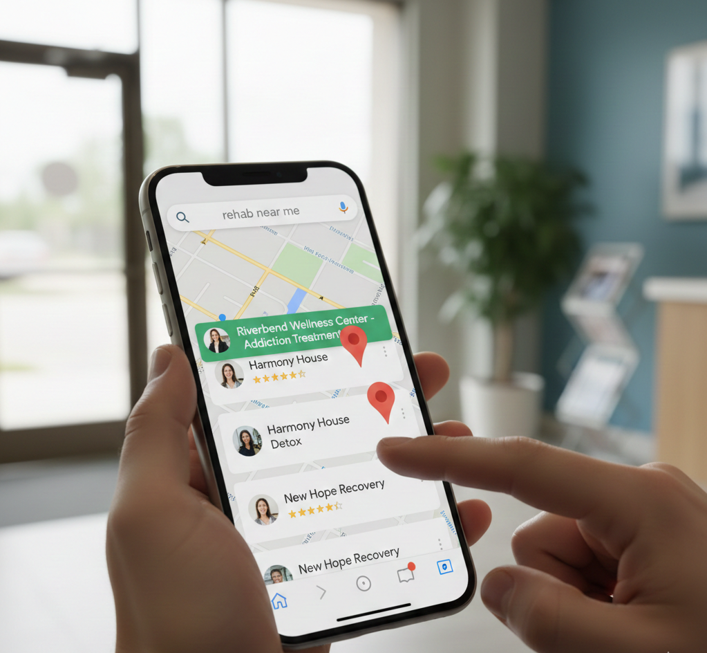
Winning the Local Search War: How to Master Google's Map Pack for Rehab Admissions
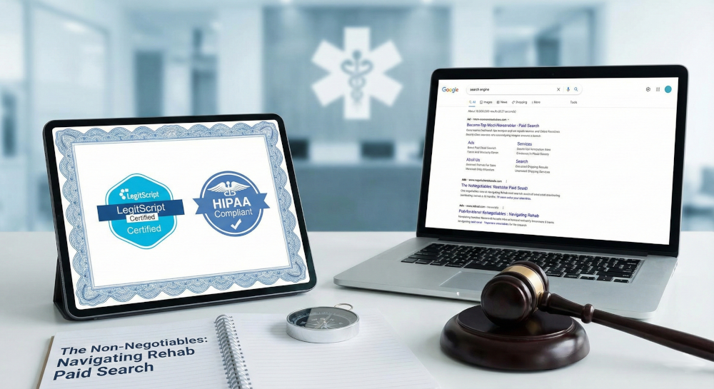
The Non-Negotiables: Navigating LegitScript and HIPAA Compliance for Drug Rehab Paid Search
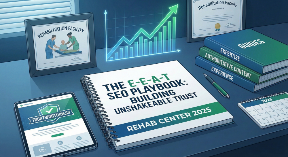
The E-E-A-T SEO Playbook: Building Unshakeable Trust for Your Rehab Center in 2025

Beyond the Bed Count: Marketing Client-Centered and Trauma-Informed Care

Contact us today to get the conversation started!
Great post! it was very insightful and informative. Keep posting you great work.
Thanks for reading!