A Foldable Web refers to designing websites adaptable to foldable devices, such as smartphones and tablets with foldable screens. This trend matters for web design and digital marketing as it requires responsive layouts that seamlessly adjust to varying screen sizes and orientations. It ensures optimal user experience and engagement across these emerging devices, becoming crucial in a rapidly evolving digital landscape.
Though not widespread, foldable mobile devices have hit the market. As these devices become more commonplace, and we see devices with dual screens that can be used as one continue to grow in terms of usage, we can expect web design to change to keep up with the trends and keep a quality user experience. This could lead to the biggest change to web design in more than 10 years. Let’s take a closer look at what this could mean for web design as we know it.
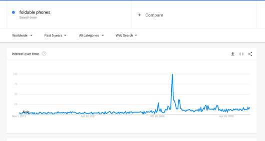
Source: Google Trends
The “foldable web” will bring with it new challenges and opportunities, and quite possibly new syntax. It could be the biggest set of changes we’ve seen since the introduction of the smartphone. Coders and users have gotten used to things – desktops, smartphones, and tablets. If only it stayed that easy! Responsive design has helped, but foldable innovation changes everything.
New Experiences Mean New Standards and New Problems
Foldable screen technology research started in the 1970s, but its development didn’t really start until the turn of the millennium. It’s only within the last few years that consumer devices have made their way to the market.
The Galaxy Z Flip mimics an old school flip phone, but others like the Huawei Mate X feature screens that wrap around the outside of the phone. Others operate like electronic books that feature two interior displays that function as one screen when the device is fully open. It’s common to see a separate smaller screen on the outside that lets users get the information they need without having to unfold the device to use it.
New hardware means updated software. Microsoft has been responsive to foldable technology because they are working on foldable devices of its own. Microsoft developers have published an explainer proposing a new CSS media query and a new JavaScript API. In a GitHub post, they discuss a number of potential issues with foldable devices, including fold area functionality and the variety of hardware in the market.
By developing a spanning CSS media feature, it’s possible to test whether a browser window is displaying across two screens or across a fold. This allows the content to position relative to the fold or seam, to evolve the responsive design. Along with this, they’ve proposed environment variables to help recognize orientation and segment size. These additions would allow websites to shape across three dimensions, allowing the page to behave differently when it’s flat and when it’s in an L shape. The JavaScript API would allow sites to behave more dynamically, changing what’s displayed when the screen is bent, or whether users touch one half or the other.
The proposals don’t make considerations for more than two screens or segments. If they are implemented, it will add another layer to responsive design. If things continue as anticipated, we’ll no longer be able to assume sites behave in single rectangular spaces.
As long as new web primitives remain ahead of technology, developers will be able to focus on improving site functionality.
Dual Screen Experience and the New Fold
“Above the fold” has always been prime real estate for web design, because users are more likely to pay attention to what’s on the page before they have to start scrolling down. With the introduction of foldable devices and the foldable web, comes the fold in the middle of the page.
At least, this means adjusting content so users aren’t required to interact with anything that would appear “on the fold.” If touch control is limited at the fold, or the device is partially folded, it makes the most sense to reposition certain elements so they are on one half of the screen or the other.
On the other end of the spectrum, designers will able to treat websites like a mini dual-screen setup where the two halves can be used to display different things. Ultimately, this allows content to displayed more like an app.
When looking at a recipe in the kitchen on your tablet or smartphone, how many times have you wished you could have the ingredient list on one side and the directions on the other? With a dual-screen setup, this could easily become the standard. On a news website, it may mean having the article you want to read on one side, and the related reading on the other.
In the majority of cases, the “foldable web” will mean better-optimizing sites for tablet-sized displays. Right now, tablets don’t account for much of the global market share – coming in at around 3%. Mobile phones account for 52% and desktops cover 45%. If we reach the point where foldable devices make a dent in the market share, it will be harder to ignore them, and we’ll have to change the standards to account for them so that users get a quality experience on those devices.
When we start to see Apple releasing foldable devices, it’s a safe bet sales will increase. As foldable tech comes into the market, responsive design will have to adapt simply to maintain existing user experience and functionality.
Right now – we can expect the trend will at least mark the next phase of responsive design. It means creating multi-screen experiences. How far these experiences go depends heavily on how widespread the foldable device market becomes. There’s no guarantee that we’ll see foldable devices take off the way smartphones did – and we can expect that they’ll remain fairly rare until the price of the technology decreases rather significantly to make it more affordable for the masses. Most of these devices cost nearly $2,000, putting them out of reach for the average consumer.
Developers and designers have to push the platforms. There’s the chance to make websites more fluid, with functionality never before available. It’s an opportunity to venture into uncharted territory. It’s the biggest change the web has seen since the iPhone. The changes to syntax are still largely unknown, so now is the time to begin experimenting, making suggestions, and offering feedback.

OTHER ARTICLES YOU MIGHT BE INTERESTED IN

SMG Marketing Makeover 2025 - What’s Working, What’s Not, and What’s Next

Using Community Outreach as a Marketing Strategy


A Complete Guide to Google Performance Max (PMAX) for Healthcare

Tips for Spring Cleaning Your Digital Marketing Efforts

Medical Practice SEO - The Ultimate Guide for Doctor's Offices

10 Digital Marketing Ideas for Doctor's Offices

Contact us today to get the conversation started!