It’s safe to say nearly every website online today has an About Us page or a variation thereof. It’s essential to tell your visitors who you are, what your company does, and what they can expect to find on your website. It’s your chance to showcase your brand, your people, and your purpose.
There’s more than one way to get the job done. That’s what makes creating your About Us page so fun, and yet at the same time, so time consuming and frustrating. Even the best writers struggle to write about themselves from time to time.
Since the About Us page is bound to be one of your most visited web pages, it had better be good!
Let’s discuss how to knock it out of the park.
Overview
Start with Your Story: Hit the Main Points
You should tell a compelling story about your brand and company. Make sure it addresses the main questions people have:
- Who?: Tell the story of who is involved with the company. Mention the founders, and give each of them a few sentences. Pack the sentences with details about how each person relates to what the company does – showing why they are essential to the team. Typically, this includes education background, but make sure it doesn’t read like a resume.
- What?: What have these people done in the field? How did they come to the business in the first place? If they didn’t found the company, did they take it over from another person? Describe the hard work of the early days. Detail their successes along the way. If there have been setbacks, don’t shy away from those either, provided they don’t show incompetence. As humans, we connect with what we relate to. If you don’t show some human side to your company, you’ll struggle to make connections to your readers. Use this space to show why you’re trustworthy, and keep it current with any new information.
- When?: Give dates – even if it’s just the month and year – of any major milestones in company history. When were you founded? When did you add key staff? When did you add new products or services? You can also use this space to introduce any upcoming milestones. If your company is new, use this space to establish the backgrounds of all your major staff so readers know they’re experienced in the industry.
- Where?: Tell the story of what’s most interesting to you here. You can keep it simple, only mentioning the location of your corporate office. Or, you can take it further and include areas where your company does business and where you source your products.
- How?: Include a few sentences about how you do what you do, and how you became a business.
- Why?: This is the most important part, which is why I saved it for last. Explain why you do what you do, and let your passion shine through. This is your real chance to connect with your readers on the most basic level and building trust.
A Picture Really Is Worth 1,000 Words
Don’t just tell your audience. Show them. Use photos to match the names of people to their faces. Use some action shots. Are you a restaurant owner? Show photos of your kitchen working the line during a dinner service. Show your front of the house staff interacting with the guests. Are you a retail store? Show photos of your most impressive product displays, or customers in the store.
Did you know the brain processes visuals 60,000 times faster than text? If you want to make a solid first impression, make sure there are images to accompany your text. The majority of people won’t read large blocks of text – and those that will aren’t going to read every single word anyway. This is especially the case on a mobile device.
Make sure your text is formatted with short paragraphs, headlines to break up the text, organized with bullet points where necessary. Accent it with photos and video. Including video on a landing page can increase conversion by up to 80%.
Tips to Really Add the Wow! Factor
Your About Us page needs an element of Wow so you stand out from the competition. Use this space to tell your clients exactly what you’re going to do for them, and how you’ll get the job done. Share examples of how you’ve overcome industry challenges. This will help your prospects feel more comfortable with you as the one meeting their needs because they’ll be able to see how you’ve helped others.
Common Mistakes People Make When Creating Their About Us Page
- Losing sight of the target audience: If you’re not crystal clear on who your target audience is, you won’t be able to write the best possible About Us page. Even though the information you’re sharing doesn’t necessarily change, the way you write it will need to be adjusted to what will best resonate with the audience. Go back to your buyer personas for a reminder of who you’re “talking” to, and write everything as if you were speaking to your ideal customer.
- Making it about them: Yes, your About Us page does need to talk about you. But, it must be about more than a list of accomplishments and credentials. It should tell your story, but leave room to show how your business can help your prospective customers. Make sure they know how you can solve their problems, and ultimately make their lives better.
- Skipping the opt-in form: Just because the About Us page isn’t the most popular page on your site doesn’t mean people aren’t looking at it or landing on it. If you don’t have a visible opt-in form, many of those people won’t ever come back. That’s money you’re just throwing out the window. Email marketing offers a whopping $44 ROI on every dollar spent.
- Leaving out the website’s purpose: Tell your visitors what makes you stand out from the competition. Why are you the best at what you do? You can show off a little bit. Let them know what they can expect from your website. Give them information about the products and services you offer. Tell them why people work with you and buy from you.
- Not linking to products/services pages: People won’t go to your products and services pages from your About Us page unless you direct them to. Feature your most popular blog posts and product pages. Tell readers where to go after they’ve learned about your business.
- Packing it with too much information: Your About Us page isn’t a novel. Keep it limited to 400 or so words – using photo and video to add more information. If you’re struggling to keep it concise, go to your elevator pitch to help you.
- Skipping social proof: Social proof helps build trust, authority, and credibility. Display testimonials from previous clients. Include logos for press mentions, and screenshots of social media shout outs that reinforce how incredible you are.
- Not providing contact information: Forgetting the opt-in form is one costly mistake, but not providing contact information is another. It doesn’t have to include an address and phone number, but at the least should include an email address, and where you can be found on social media. If you don’t provide a way for visitors to get in touch, they won’t reach out if they have any additional questions. This is especially important for solopreneurs as people will want to find out more about your rates and services.
Awesome About Us Page Examples
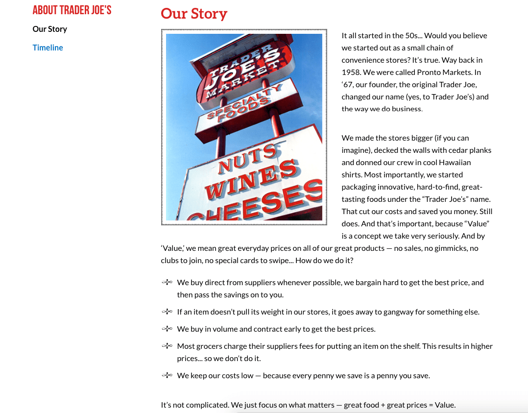
Trader Joe’s was founded in the 50s. Their Our Story page tells shoppers how they bring value. Because they’re based on bringing quality food to people at lower prices, many shoppers may wonder how they’re able to do that. It makes sense they’ve made that the main focus of their About Us page. They also have a timeline of their history on a separate page, so customers can learn about everything from when the company was founded until now.
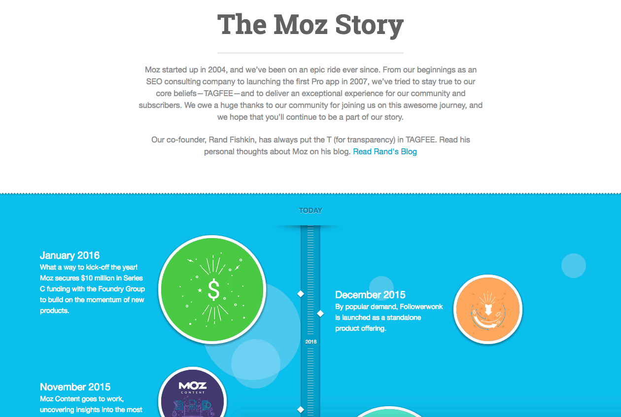
Moz has a great About Us page because they get straight to the point about who they are, what they do, and how long they’ve been doing it. And for those who want to scroll through, there’s a great visual timeline that dates all the way back to when the company was founded in 2004. Granted they’ve not updated it since January 2016, but we know they will.
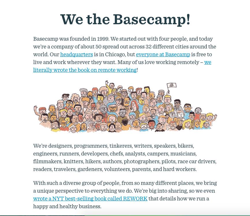
Basecamp does a great job of showing when they were founded, how their company works, and what they do. They also link to products and services to show credibility. It’s concise, yet sells the company well. Previous versions of the page indicate they once had people working in 26 cities, so they’ve also done a good job at keeping everything up to date. You can see the message stays the same overall, but they’ve added more accomplishments over time.
Don’t Write it Once and Forget it!
There’s no one “right” way to handle your About Us page. Choose a technique that best aligns with your goals and values as a company. The important thing is you take the time to check on it from time to time – usually once a year is enough. Your company never stays the same from one year to the next. You’ve no doubt gone through some changes and hopefully, growth, since the first year you were in business. Add those successes to your About Us page every year.
When’s the last time you looked at your About Us page? Is it time for an update?
Contact us today to get the conversation started!
