
In 2014, mobile exceeded PC internet usage. While the majority of users’ time was spent on apps, mobile Internet usage made up 28 percent of total worldwide web traffic. Search engines are the most popular sites with 77 percent of mobile users accessing them, ahead of social networking, retail and video sharing sites. Having a strong SEO strategy in place is important if you want to capture the growing mobile market. One of the best ways to do this is by implementing a mobile website design.
Mobile Design and SEO
While there might be some confusion over Google’s stance on mobile SEO, there is one thing that is not contested: Google is putting an emphasis on mobile-friendly sites. In 2014 they announced a “mobile-friendly” tag for sites that meet all of Google’s criteria for mobile optimization and also mentioned they were planning to test the mobile-friendly criteria as an additional signal for page ranking. What does this mean for you? Basically, if your site is not optimized for mobile, it will rank much lower in search results, which will ultimately reduce your organic reach.
While there are three different options for a mobile configuration, Google recommends a responsive web design as the best way to target mobile users. A responsive design allows a site to reformat itself depending on what device it is displayed on, making it user-friendly on tablets, smartphones and desktops. The best part is that it uses a single URL, which makes it simpler for Google to crawl and index content. But just because it’s responsive doesn’t necessarily mean it is mobile-friendly. Ultimately, the choice of whether to offer a separate URL, responsive web design or dynamic service (uses the same URL but generates a different version of HTML based on device) is up to you as Google does not favor any particular format.
There are, however, several best practices to ensure your site is mobile-friendly for all design formats.
Page Speed
74 percent of users will leave a site if it takes longer than 5 seconds to load. Due to hardware and connectivity issues, load times are even more important on mobile devices as users are generally using for immediate information needs. One of the best ways to reduce your load speed is to optimize your images to a smaller size, minimize code, utilize browser cache and reduce redirects.
Avoid Flash and Pop Ups
There are many mobile devices that do not have the Flash plugin available. Rather than alienate these users, you may want to simply avoid Flash altogether on your site. If you want to utilize some fun effects like an image slider, you should take advantage of HTML5 instead.
Another thing to avoid is pop-ups, whether that’s to subscribe to your newsletter or receive a free ebook. These pop-ups are intrusive to mobile users who are coming to your site for a specific reason. They are often difficult to close out of as well, which could lead to a high bounce rate.
Utilize CSS, JavaScript and Images
In the early day, many mobile devices could not support these elements so many webmasters would simply block them. Today, smartphones and tablets are more than capable of displaying all of these features. Not to mention, search bots are crawling your site for these elements in order to categorize your mobile site solution.
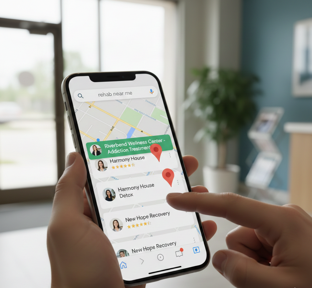
Optimize for Local Search
On mobile, 4 in 5 searches are local in nature. Of these local searchers, 88 percent take action within a day whether that’s contacting the business, visiting it or making a purchase. Due to the overwhelming popularity of local searches on mobile, Google has added local signals in the mobile search algorithm. If your business has a local element you should take the opportunity to optimize for local SEO. This means:
- Standardizing name, address and phone number
- Include city and state in your metadata
Think Mobile First
While smartphones and tablets might be revolutionary in the technology industry, it still has its limits. The easiest way to ensure your site is mobile-friendly is to approach your entire design with a mobile first mindset. This way you will already have tackled the issues of the small screen, less powerful processor and touch based navigation.

OTHER ARTICLES YOU MIGHT BE INTERESTED IN

AI in Addiction Marketing: Leveraging Automation and Data-Driven Personalization

Beyond the 'Call Now' Ad: Using Funnel-Based Messaging to Nurture Drug Rehab PPC Leads

Winning the Local Search War: How to Master Google's Map Pack for Rehab Admissions

The Non-Negotiables: Navigating LegitScript and HIPAA Compliance for Drug Rehab Paid Search

The E-E-A-T SEO Playbook: Building Unshakeable Trust for Your Rehab Center in 2025

Beyond the Bed Count: Marketing Client-Centered and Trauma-Informed Care

Contact us today to get the conversation started!