To improve your conversions on your website, focus on user experience with a clear, easy-to-navigate design. Optimize call-to-action buttons for visibility and compelling action. Test different page layouts, headlines, and content with A/B testing. Ensure mobile responsiveness and fast loading times. Personalize content to meet your audience’s needs and preferences, effectively guiding them towards making a purchase or taking desired actions.
Choice is presented as a positive thing. Users dream of the freedom to make the choices they want, to shape the world around them, to customize and individualize.
But there is such a thing as too much choice, and the paradoxical task of any designer or marketer when creating a page meant to sell to a user is to provide a guided experience without becoming too obvious.
In essence, you’re meant to be robbing users of the wrong choices, and helping them make the best one.
But it has to be done organically. A successful conversion – or more specifically, a strong landing page – relies on several moving parts.
You need a good product. You need eye-catching headlines. You need great flow. You need trust – in the product and the brand. And, most of all, you need the right call-to-action, at the right time, with the right copy.
Getting every element to harmonize in one big happy package is difficult. And what a lot of people don’t realize is that pretty much no one does it right on the first try. The greatest advertising firms experiment with different page elements, campaigns, offers, and ideas, until they get something that moves the metrics along. They keep trying. So should you.
The next time you take a look at your landing page, ask yourself if it’s truly convincing you to buy into your own product – and if any of the following elements might help with that.
Overview
Testimonials and Reviews Help
We’ve mentioned the element of trust. Trust is only built over time, but you can buy a little bit of trust in a potential customer’s eyes by selling them the stories of past customers.
Since the explosion of the World Wide Web and birth of e-commerce, customer reviews and social proof have become an irrevocable part of doing business in the brave new world. Every product, service, and new release is endlessly scrutinized by the average consumer, brand evangelist, and influencer alike.
New phones are given teardowns, durability tests, dozens of unboxing videos, in-depth performance reviews, technological showcases, and a veritable gamut of press on a dozen major tech outlets in media. The same goes for products and services across industries. People have become used to researching what they buy, to build confidence in a product before making the final decision to purchase it.
That can be a boon or a bane depending on the quality of your offer. Take advantage of user reviews, testimonials, happy emails and messages, and grateful former clients and customers. Wear these with pride as a badge of honor and watch them help you garner trust in new paying customers
Do Pop-Ups Right
Pop-ups are universally reviled, yet they still work. However, it takes a lot of good will to sell a pop-up without infuriating your visitors. Here are a few important things to keep in mind:
- Pop-ups have to be very easy to close, ideally immediately. Don’t bother hiding the option to return to the page itself – your customer is more likely to just leave instead.
- Pop-ups should happen once per visitor, not once per page load. Pop-ups can be built to utilize visitor cookies to check whether a visitor has seen the pop-up in the past.
- Pop-ups should occur some time after the user has had time to find the information they needed. Give a visitor 30 seconds to a minute to see if they’re interested in what you have to offer. If they linger around for longer than that, they may be more receptive to a pop-up if it has a good offer. Speaking of which…
- Pop-ups should reward users, not annoy them. Avoid prompting users to buy your book at full price if they hadn’t already seen it. Instead, offer a limited-time discount on your courses or products for first-time visitors, or a quick newsletter signup for a percentage discount on the first order.
There’s a delicate balance between a pop-up done well, and one that ruins you both in the eyes of the user, and Google. The search engine hates intrusive pop-ups. Another option you might want to consider – if it meshes with what you’re offering, i.e. a wide collection of products – is an exit-intent pop-up.
Identify a Good Call to Action
“What are you waiting for? Buy now! “
It’s blunt, it’s direct, and it can work. But it might not be ideal. You can optimize your call-to-action by creating copy for it around your audience and customer base, and integrating it into the landing page smartly, at multiple points – usually in the beginning, middle, and end.
Landing Pages are Straightforward
We’ve mentioned the importance of choice to the user, and the importance of managing those choices, and presenting ones that actually matter. But it’s also important to separate a landing page from the rest of your site content.
The landing page should be a on-the-rails experience. Like a theme park ride, it should be engaging, interesting, and entirely linear. Don’t take this as an invitation to go too far with the add-ons, though. Landing pages need to be direct in their message as well, and avoid distractions.
Your headlines should flow from one to the next, with minimal to no elements removing a visitor from the experience. Accessibility matters here, too – simpler landing pages that are easier to follow and navigate will appeal to a wider audience, and make it easier screen readers to aid differently-abled users, for example.
The rest of your on-site content should lead to other on-site content, help the user discover more information, and lead to other services or products. There’s more choice involved, and users may have their very own unique page experience.
Don’t try to design a landing page like any other part of your website. Optimize it into the best linear experience it can be.
Refrain From Demanding the Full Form
People like to finish what they’ve started, but they can be quite apprehensive about starting things. Make sure that at least one of your calls to action appeal a customer to sign up for deals and promotions, once they’ve spent enough time on your landing page to be intrigued by your offer, and clearly interested in what you have to give.
But make it as easy as possible to become a part of your customer base. It does help to gather more data on who you’re selling to, especially in e-commerce, but forms are boring, obtrusive, and ruin the flow of the page. Instead, ask for an email only, and give them the opportunity to finish the sign-up process from their mail later. Or provide third-party sign-on opportunities through Facebook, Twitter, and Google.
There’s a Lot More to Do
These are just a handful of ways you can spruce up and improve your landing page, and in turn, improve your conversions. Individual strategies will always look different, depending on what it is you’re offering, and who you’re targeting.
Your copy needs to be unique to your brand and product, and appeal to your audience. Branding and image use are critical, as is page flexibility and user-friendliness, both on big and pocket-sized screens.
We can help you build the best landing page for your business. Give us a call today.

OTHER ARTICLES YOU MIGHT BE INTERESTED IN

AI in Addiction Marketing: Leveraging Automation and Data-Driven Personalization
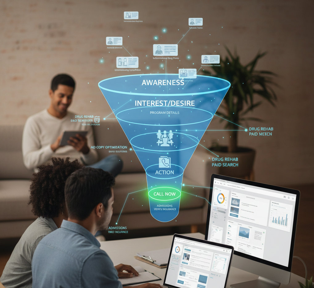
Beyond the 'Call Now' Ad: Using Funnel-Based Messaging to Nurture Drug Rehab PPC Leads

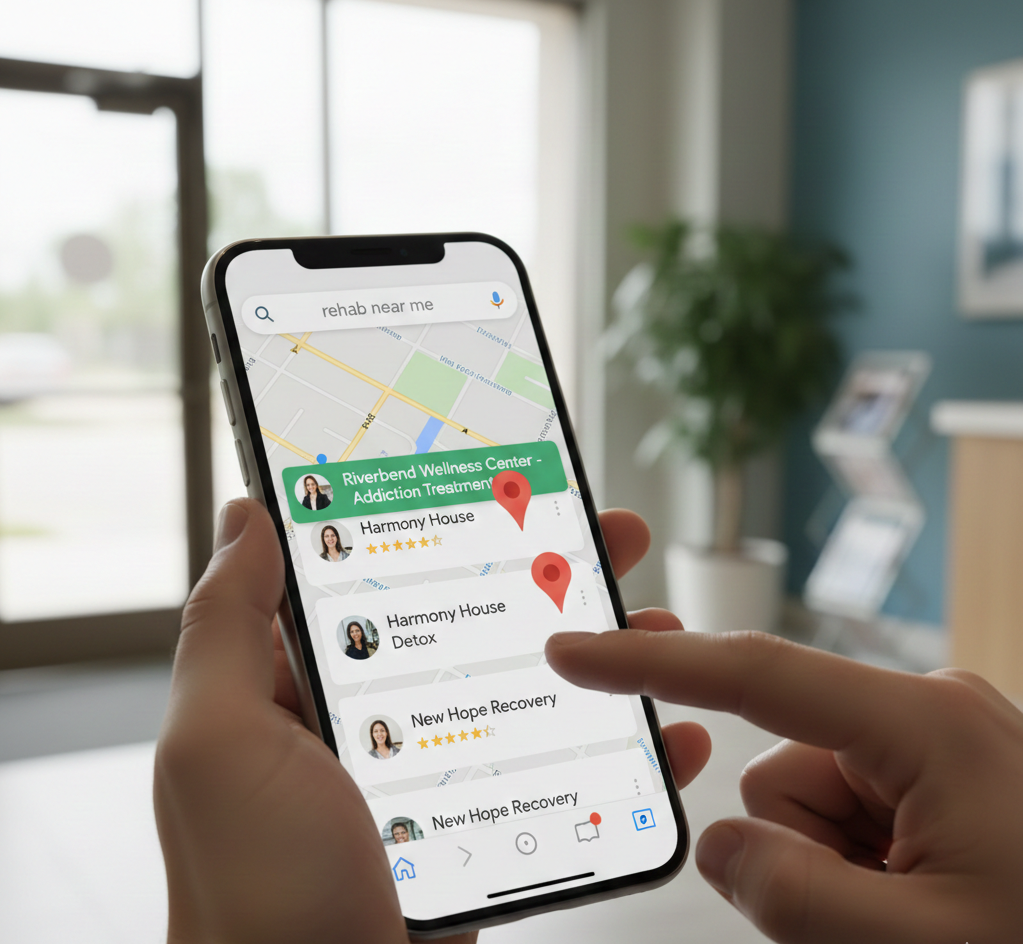
Winning the Local Search War: How to Master Google's Map Pack for Rehab Admissions
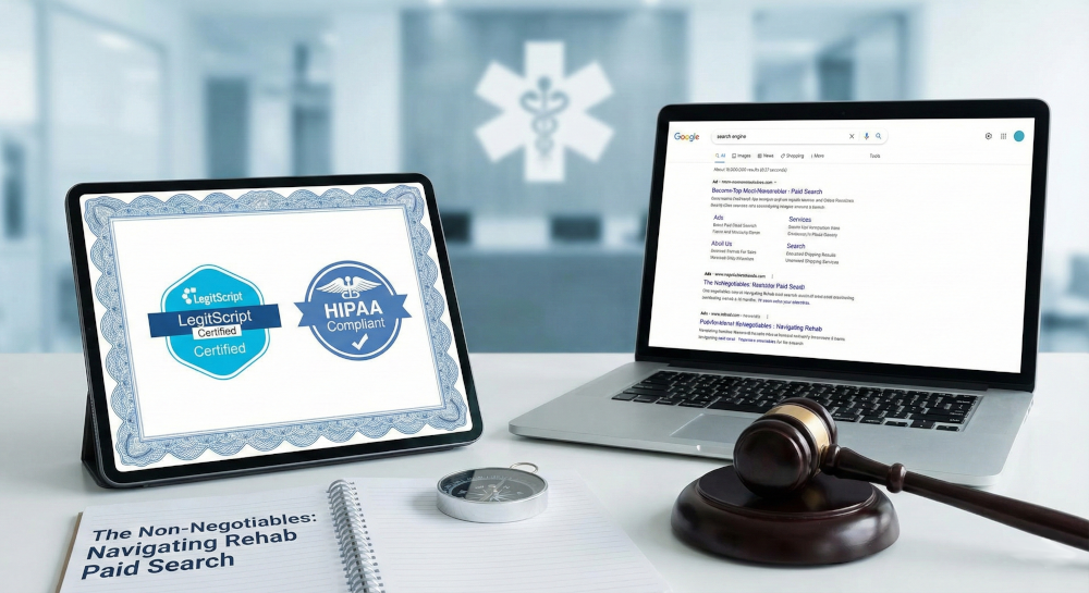
The Non-Negotiables: Navigating LegitScript and HIPAA Compliance for Drug Rehab Paid Search
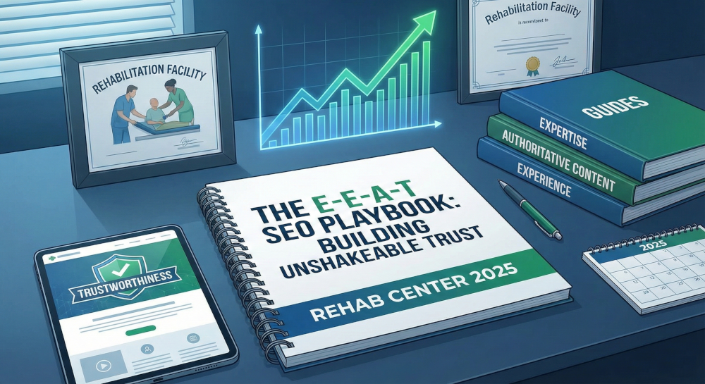
The E-E-A-T SEO Playbook: Building Unshakeable Trust for Your Rehab Center in 2025
Beyond the Bed Count: Marketing Client-Centered and Trauma-Informed Care

Contact us today to get the conversation started!