
Page speed and site speed: two important factors webmasters overlook way too often, especially in an online environment where we use more media than ever before. As the world shifts to a preference for images and video – or at least text content with images and video – a significant number of sites seem to be struggling to keep up in the area of speed. They stuff in tons of super-engaging media, yet struggle with incredibly high bounce rates that cripple conversions.
The problem with media formats like images or video (or even design technologies like parallax and animation) is that they’re inherently larger in size. Unlike text or even CSS, they take much longer to load by comparison.
Why is this a problem?
First, page speed directly influences conversion and bounce rates. If visitors have to wait more than a few seconds to access content, they’re significantly more likely to “bounce” away from the page and go somewhere else. But Google also considers site speed to be a critical ranking factor in search results, and that means a slow site speed could kill your SEO efforts, too.
Overview
Fixing Site Speed Issues
As a webmaster problem, site speed concerns aren’t going away anytime soon. In fact, it’s only likely to get worse as surfers and visitors demand more intensive forms of media and more interactivity on the sites they visit. It takes time for computers and devices to “catch up” to these increased demands. That leaves you, the site owner, in charge of determining balance between the need for media and engagement with the desire for speed.
Stripping back on media isn’t always the answer; in fact, it can worsen the problem by causing serious engagement issues (plainly put, your content becomes dry and boring). And that means you’ll bounce people for an entirely different reason. But sitting on a site speed problem or just ignoring long loading times? That’s not the right answer either.
In the next few sections, we’ll teach you a few of our most beloved page and site speed secrets, including how to improve your page speed, how to optimize your current media-rich content, and how to forge a stronger foundation for future media use that prevents unnecessary loading times.
Choose Your Host and Server Wisely
Whether you’re self-hosting on a server rack in the office or working with a company like DreamHost or GoDaddy, server performance issues can significantly hamper your site speed. A low-quality server or connection will cause the site to lag out and struggle to keep up with requests; this produces extra loading time for visitors.
Shopping for services? Check the offering for response times. Google suggests keeping your server response time under 200ms – the designated “average rate” for well-optimized websites. If your current response time is higher, it’s time to assess your server and find out what’s causing the issue.
Unfortunately, diagnosing server response times isn’t always easy. Even Google points this out in their Developer Resources, quoting “…slow application logic, slow database queries, slow routing, frameworks, libraries, resource CPU starvation,” and “memory starvation” as the primary driving forces behind server response issues. Your hosting provider and/or IT staff can help you troubleshoot server issues most effectively. If you’re self-hosting, it’s worth hiring someone to troubleshoot even if you don’t have someone on staff.
Ultimately, a high-quality server host with good support is best choice for most business websites. Small websites may do fine on shared hosting plans, but medium to large businesses should consider dedicated or Virtual Private Server (VPS) accounts instead. They’re more reliable, especially for media-rich sites.
Use Responsive Web Design to Optimize Speed
Everyone knows that responsive web design improves search ranking through Google. The search engine giant’s most recent update clarifies responsiveness as preferred, but responsive design can actually save you a few seconds in loading time, too – especially if you use it correctly.
Here’s the key. Forcing visitors to render images and video presented in resolutions larger than their device they’re using slows load times. For example, if someone lands on your website from a smartphone, yet the main page has a massive image in the background designed for a 4K monitor, a lack of responsive design will force them to load the image at its native resolution.
What should you do instead? Start by making all images and video responsive following Google’s best practices for responsive images (found here). Use grid systems, simple cropping, variable width options, and consider whether vector, PNG, GIF, or JPG is best for the type of content you’re delivering. Line drawings and graphs may be better delivered as vectors, while photographs work best as lossless PNGs.
If you’re targeting Chrome and Opera browsers specifically, .webP image formats are another optional file format that’s smaller, speedier, and experiences much less of a quality hit than other formats.
Follow similar options for videos – stick with formats like MP4 h.264. Be cautious about the size of the videos you place on your website, too; including just 5 MB of video on your homepage will significantly slow ddownloadingtime for all but people with the fastest internet. Place these videos on a separate hosting site (e.g., YouTube or some other CDN) and embed them in your site instead. If using embeds from sites like YouTube, avoid setting default resolutions above 1080p.
Show Above-the-Fold Content First
In responsive web design, above-the-fold content refers to any content that becomes immediately visible on the user’s screen when they visit your page. Exactly how much screen real estate is shown depends on the device being used to view the page, but you can expect it to include your initial navigation menu, sliders, calls-to-action, title, or main content for most website pages.
It makes sense to optimize sites to load above-the-fold content first; it’s what visitors see when they first land in. If you force the page to load this content first, it will buy you a few more seconds of loading time for the rest of the site while lowering the risk for them to bounce away in frustration.
Admittedly, this trick won’t lessen your overall loading time, but it can negate the consequences of a high loading time on a particularly media-rich website. Just don’t forget to make adjustments at each responsive level.
Minify Your Resources
Set the shrink ray down: no, we won’t mean minify as in “Honey, I Shrunk the Kids.” In terms of website optimization for speed, minifying refers to cleaning HTML, CSS, and JavaScript codes to be as lean and efficient as they possibly can be. Think of it like living a minimal lifestyle, only in code.
The best way to do this is to go through all of your code and strip out unnecessary whitespace, remove unneeded comments, and rename variables to make them as small and concise as possible. Using CSS instead of images (when it makes sense) can also pare back on loading times. Live by the rule that, “if you can do it in one step, don’t do it in two.”
Additionally, reassess your need for bulky media that demands JavaScript and other bloat-inducing languages. There will always be a few situations where they’re needed, but there are often better options. The same is true for Flash vs. HTML5 and other outdated technologies.
Enable Cached Pages
Unless every piece of content on your site updates on a daily basis, you should enable page caching for visitors. Caching allows visitors to load media content once and then retain a copy of that content for future visits. Instead of being forced to re-load the content from the server on the next visit, which can take time, it loads from their own local machine much more quickly. This approach is especially useful for large resolution video, games, and web apps.
Google recommends setting cached pages to a minimum time frame of one week for assets that change and a maximum time frame of one year for static assets. You may need to tweak these numbers to better suit your website, but even a cache time of a few days can make loading times more fluid for repeat visitors.
Feeling a bit overwhelmed by your site speed issues? We get it. Web development and SEO “best practices” change at a breakneck speed. We’d love to chat with you about a few ways you get position yourself for success – just reach out!

OTHER ARTICLES YOU MIGHT BE INTERESTED IN

AI in Addiction Marketing: Leveraging Automation and Data-Driven Personalization

Beyond the 'Call Now' Ad: Using Funnel-Based Messaging to Nurture Drug Rehab PPC Leads

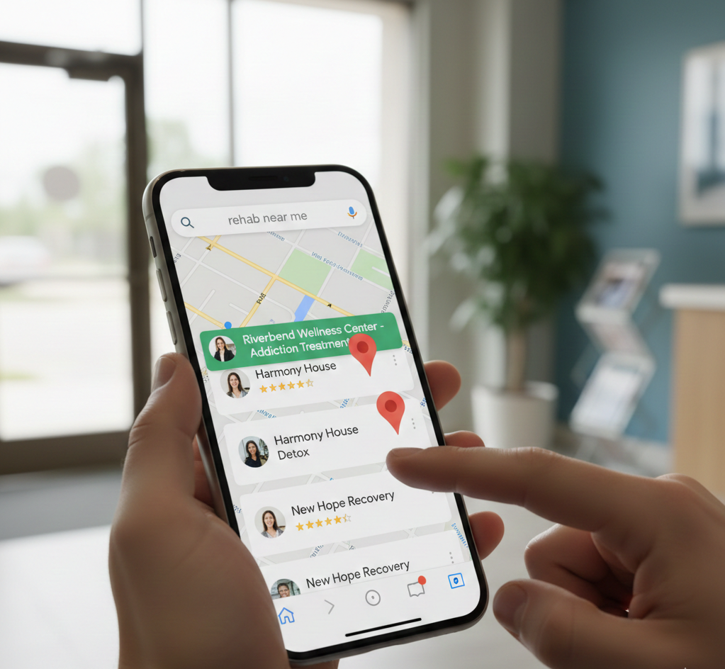
Winning the Local Search War: How to Master Google's Map Pack for Rehab Admissions

The Non-Negotiables: Navigating LegitScript and HIPAA Compliance for Drug Rehab Paid Search
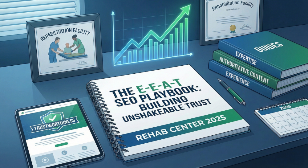
The E-E-A-T SEO Playbook: Building Unshakeable Trust for Your Rehab Center in 2025

Beyond the Bed Count: Marketing Client-Centered and Trauma-Informed Care

Contact us today to get the conversation started!