
Many brands lack a key piece of the puzzle for consistency – a brand style guide. Why do you need one? Well, if you’re like a lot of businesses out there, you’ve got several people, some in-house, some contracted, working to produce all your collateral and assets. And if you don’t want to spend a lot of time editing to ensure everything looks like it came from the same place, the brand style guide can save the day.
You can use the guide to create anything you need for your brand – your website, advertisements, social media graphics, internal memos, or anything else your heart desires. I know you’re thinking, “If these things are such life savers, why aren’t more businesses using them?” The answer is quite simple: they take time and effort to create – and time, especially for the small business owner, is a precious commodity, often better spent on different tasks.
But, imagine this:
You hire a designer to get your logo situated. You’re happy with it – you have your colors, fonts, spacing, and all that figured out. You move on, and months down the road, you need the information again. Your original designer doesn’t have the files anymore, and can’t take on new work. You have a deadline for a new project that needs the assets, so you have no choice but to go find a second designer – and thus find yourself explaining the needs for colors, fonts, and spacing, yet again.
Your brand style guide, if you’d had it established, would cut all that craziness out – because it clearly outlines your requirements. You can hand it off with to that second designer, and anything they, or a third, or fourth designer creates, will look the same as what that first designer created, and you’re not spending time – when your business is growing and you’re busy with other tasks – rehashing all the details to get what you need.
That’s why I’ve created this handy little cheatsheet – a guide to style guides, if you will, to help you.
Overview
Determine Logo Size and Placement Requirements for the Brand Style Guide
Your logo is an essential part of your brand, and needs to be consistent as you go along. Use your style guide to dictate the ways you allow use of your logo. You should include any acceptable variations – such as black and white usage. As important as proper usage is, your brand style guide should also clearly define unacceptable logo usage.
For guideline examples, you can take a look at Google and their requirements.. They tell you exactly what you can do, and exactly what you cannot, to remain in compliance. For instance, you must distinguish the trademark from the surrounding text. You cannot use anything other than Google approved artwork, and you should not feature the brand in any way that could imply a relationship between your company and Google. For more inspiration, check out the Apple Style Guide.
Choose Your Color Palette
Orange is orange, and red is red, right? Wrong. Colors can have slight variations from program to program, and from designer to designer. This is why you must establish the color palette in the beginning, and stick to it over time.
You can choose whatever colors you want, and with the HEX color codes in the style guide, designers, regardless of who works on what design asset, will always been the same. But, beyond the HEX codes for web uses, you’ll also need the CMYK values and Pantone colors for anything that will be printed. This is because of slight differences between the RGB colors used for the web, and CMYK used in print. Sometimes, though, these differences are much more drastic than you’d think, so it’s important to check them manually to ensure accuracy to save time and money before printing.
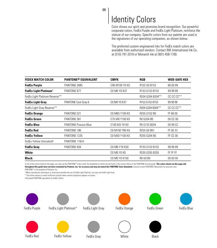
Source: FedEx Brand Guidelines
Choose Your Fonts
Regardless of the fonts you choose – they should be a reflection of your corporate identity. And beyond that, the typography must remain consistent to send a professional message. In your brand style guide, you can dictate which fonts are used, the size and typeface used, and how. It’s okay to have a variety of type faces, as long as the purpose is established for each. The style guide tells designers which ones to use and where. If possible, go beyond the size, factoring in kerning and leading, for true consistency.
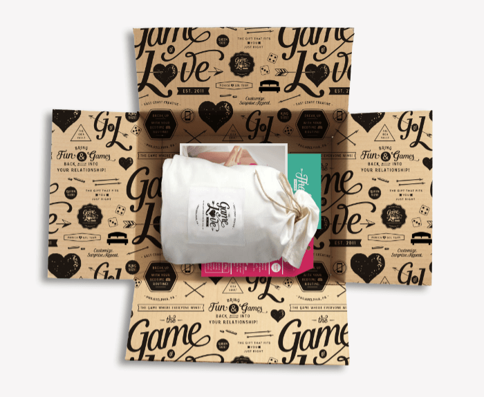
Choose Your Iconography
Patterns and icons can be used to set your brand apart from others, if they are used effectively. You don’t have to have iconography, or patterns of course, but they can be useful on your website or packaging. Take for instance, the pattern on the inside of the box from Game of Love, done by October Ink.
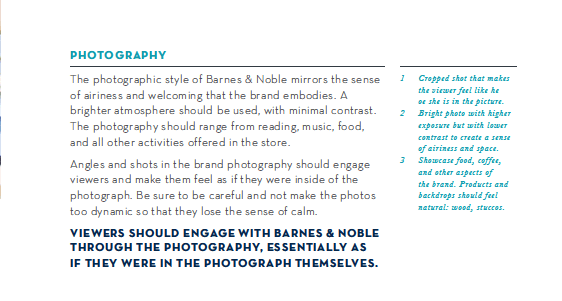
Choose Your Photography Specifications
Photography is certainly a reflection of your brand, and depending on the style, can evoke the wrong response from the audience. Photos are necessary for all brands – even if you’re not taking photos of actual products. If you routinely work with photographers, include style and specification notes to help make their job easier. As you can see from the Barnes & Noble Style Guide, there’s a page completely dedicated to photography.
Some photographers can shoot in whatever style you ask, while others shoot in their own unique style. This is why knowing what you want ahead of time, and providing the information to photographers you want to work with, can be beneficial, saving you time and money.
Factor in Your Web-Specific Elements
Your website needs to match your brand as much as anything else. Many of thing things you create for print will work for digital, but there are also elements you’ll need only for online – like Facebook and Twitter profile covers, and other social media images, that you may not have considered.
Your website will have elements like buttons, that aren’t used anywhere else, but should still match your brand. Don’t forget to consider your 404 page – an error for the user. You could design it to at least make it fun.
Remember Your Brand Voice
Your brand voice and brand style guide go hand in hand. You should sound and look a certain way – and even though it’d be nice, it’s not always possible to have the same person writing for you all the time. Even if you have the same person producing your web content, that person may not be available to write the copy for print, and so on. That’s where the brand voice comes in handy – giving anyone who writes for you some basic guidelines to follow so that everything has the same sound.
In this section, you can include words and phrases you want to appear, along with a list of words that should be avoided. Information about the target audience for your website can also be helpful.
Bonus: Writing Style Guide
As a kind of extension to the point above – I thought I would add a writing style guide as a bonus. Ideally, this document should be separate from the brand style guide, because your designers aren’t necessarily going to be your writers and your writers won’t necessarily be you designers. But, if you ever have one person who will be handling both, you could easily distribute both guides to them.
Your writing style guide is basically the same as your brand style guide, except it refers to the formatting and rules regarding the text on your website and printed brand materials. The key is to keep the document fairly short.
Being comprehensive is a good thing, but if the document gets too long, it’s hard to use on a daily basis. That’s why information about your branding, or content operations, should be kept separate.
Your writing style guide should include:
- Style Manual: There are two big ones to use – AP Style or Chicago Manual of Style. Look through them to compare, and then choose which one you want to adopt. They both have online subscriptions available you can purchase for your team to reference. There may be some exceptions to the rules for your branding, tone, and style, and you’ll want to highlight those, as well. Things to consider here include: what to abbreviate, what to capitalize, and whether or not you use an Oxford comma.
- Troublesome Words: ecommerce or e-commerce? Website or web site? Ebook or eBook or e-book? Internet or internet? And so on…
- Style and Tone: How should the content sound to the reader? Are you okay with the use of industry jargon? Should the content be written conversationally? Academically? Is humor okay? If so, what level of humor?
- Personas: We’ve already covered the importance of buyer personas, and how to create them. Anyone who’s writing content for you can benefit from seeing these, so they know they’re crafting the content in such a way that speaks to the audience.
- Graphics and Formatting: This isn’t quite the same as stuff in your brand style guide, because it refers to the use of images in your content, and how it is to be formatted. What size images are acceptable? What formats? How should images be included in the content? How should they be aligned? How should images be attributed to the source? Where should attribution be? Below the image or at the end of the article? Should text wrap around the images? What headers are used and when? Are bold, italics, and underlining allowed? Under which instances? What kind of bullets should be used? How should numbered lists appear?
- Acceptable Sources for Research: What sources are okay for information? What sources are not okay? Which brands (competition) are not okay to mention? What sources (Wikipedia) are not okay to use? Which sources do you prefer your writers to use?
- Sourcing Protocol: Which format do you want writers to use when sourcing data? Is just linking to the information okay, or do they need to use a certain citation method? Which citation method?
- Examples of Right vs. Wrong: Provide examples of the right way and the wrong way to do things – from the troublesome words and style, to the graphics and formatting, and the way the sources are cited. This way, writers can see what they’re supposed to do and how it should look, so they have something for reference.
Invest Time Now, for Smoother Operations Later
No one says your brand or writing style guides have to be done right now or even in a single sitting. In fact, it’s a good idea to involve other people in the creation of both documents, to ensure you’re not missing anything. It can be a pain in the neck to go over these details now, yes, but it can be an even bigger pain when you’ve got several assets that don’t look and sound consistent with your brand messaging.
If you’re a startup with a limited budget, Canva at Work can help you. You can save a brand kit, with colors, fonts, and a variety of templates for documents and images you’d use online and off, in the account. This can make it easier to keep track of everything as you go.
When your style guides are done, make them easy for the people who need them to find them and use them. Include them in your company’s internal wiki, a shared Dropbox or Google Drive folder, or somewhere else that makes sense. Have them readily accessible for any freelancers who may need them.
Your style guides, both brand and writing, are “living” documents. Any time new questions or issues arise regarding proper usage and you develop a solution, make sure it is included in the updated version of the guide. Date your guides with each release, so you can make sure everyone is using the most up-to-date option.
Does your company use a brand or writing style guide? Why or why not? If you haven’t created one now, is this on your list of things to do in 2017? Share your thoughts with me in the comments below.
Photo Credit: iStock

OTHER ARTICLES YOU MIGHT BE INTERESTED IN

AI in Addiction Marketing: Leveraging Automation and Data-Driven Personalization

Beyond the 'Call Now' Ad: Using Funnel-Based Messaging to Nurture Drug Rehab PPC Leads


Winning the Local Search War: How to Master Google's Map Pack for Rehab Admissions

The Non-Negotiables: Navigating LegitScript and HIPAA Compliance for Drug Rehab Paid Search

The E-E-A-T SEO Playbook: Building Unshakeable Trust for Your Rehab Center in 2025

Beyond the Bed Count: Marketing Client-Centered and Trauma-Informed Care

Contact us today to get the conversation started!