There are many website design tips for small business owners, but the best tip we can share is to prioritize the user experience (UX) of visiting your website. Ensure your site is easily navigable, loads quickly, and communicates your value proposition within seconds. While this is crucial, it’s just one facet of a multifaceted approach to impactful web design.
In the digital realm, a website is a small business’s first impression, storefront, and brand ambassador rolled into one.
Navigating the complex elements of web design can be daunting, but the payoff is a site that not only looks professional but converts visitors into customers.
In this article, you will discover several website design tips for small business websites that fuse form with function to capture and retain your audience’s attention.

Overview
Website Design Tips for Small Business
A compelling website serves as the digital cornerstone for any small business. In a landscape where online presence can make or break your market reach, effective web design is not just a necessity – it’s a strategic asset.
Here are 7 website design tips for small business websites.
1. Create an Enjoyable User Experience (UX)
An enjoyable user experience on a website involves a layout and structure that allow users to navigate effortlessly and find what they need without frustration.
This means having a clear hierarchy, legible fonts, and interactive elements that respond intuitively to user actions. Consider employing user experience design principles, such as consistency in the design elements and predictability in the navigation. Users should feel engaged and facilitated, not hindered, by the design of your website.
Features like search functionality, filter options, and informational tooltips can enhance the UX significantly. Remember, a satisfied user is more likely to return and convert.
For example, an addiction treatment website design should exude calmness and provide hope. As soon as visitors arrive, they’re greeted with serene imagery and comforting colors that align with the center’s therapeutic environment.
The navigation menu is simplified, offering clear paths to treatment options, staff biographies, and patient resources. Information is easily digestible, with the use of bullet points and infographics to explain the recovery process. Interactive elements, like a virtual tour of the facility or a recovery journey timeline, allow prospective patients to engage deeply with the content.
A seamless experience is guaranteed through quick loading times and readily available assistance via a chat function, ensuring users find solace, not stress, while exploring the site.

2. Make Sure Your Website is Responsive to All Devices
With the proliferation of mobile devices, your website must perform seamlessly across all screen sizes, from desktop monitors to smartphones. Responsive design ensures that your site’s layout adapts to the width of the browser, providing a consistent experience without the need for a separate mobile site. Text, images, and other elements should resize and reorganize themselves to fit the device in use. Testing your design across different devices and browsers is crucial to ensure that all users have a positive experience, regardless of how they access your site.
A mental health professional’s website design must convey a sense of understanding and accessibility. When a potential client views the site on a tablet, the layout shifts to a single-column format, ensuring readability and easy navigation.
On a mobile device, the contact button enlarges and is fixed at the bottom of the screen, offering immediate communication capability. The appointment booking system is touch-friendly and adjusts to the screen size, making the process of scheduling a consultation stress-free.
Testimonials from past clients are responsive, appearing as swipeable cards on mobile devices, allowing new visitors to hear others’ experiences effortlessly. This cross-device fluidity ensures that every user, regardless of the device, feels supported and guided.
3. Display Contact Options Prominently on Every Page
Contact information should be more than just accessible; it should be prominent to instill trust and offer convenience to users.
Whether it’s a phone number, email address, or a link to a contact form, it should be placed in an easy-to-find location on every page—preferably in the header or footer. This reassures users that help or more information is just a click or call away, which is particularly important for small businesses looking to build relationships with customers.
Additionally, including live chat options or quick access to customer support can significantly enhance customer satisfaction and improve conversion rates.
For a telehealth website design, providing clear and immediate avenues for contact is crucial. Every page features a sticky header with a ‘Contact Us’ button, standing out with a contrasting color.
The footer includes an expanded section with a helpline number, email form, and even a quick link to start a video call with a healthcare provider. The site design incorporates smart pop-ups that offer help without intruding on the content, appearing only when a user seems to hesitate or scroll up to indicate they might need assistance.
This design strategy puts users at ease, knowing that professional guidance is just a moment away, fostering a supportive and accessible online environment.
4. Keep Your Navigation Simple
Simple navigation is crucial for a user-friendly website. It should be intuitive, guiding visitors smoothly from one page to another and allowing them to find what they’re looking for with ease.
Ideally, aim for a menu with fewer items to prevent overwhelm—stick to essential categories and subcategories that are clearly labeled with familiar terms. Drop-down menus can be effective for organizing content, but they should be used sparingly to avoid complicating the user journey. Implementing a ‘three-click rule,’ where users can find any information within three clicks, can greatly enhance the navigational experience.
Remember, the goal is to help users reach their destination on your site with the least amount of friction possible.
For a landscaping business, the website might feature a clean top navigation bar with categories such as “Services,” “Portfolio,” “About Us,” and “Contact.” Hovering over “Services” could reveal a drop-down list including “Residential Landscaping,” “Commercial Landscaping,” and “Garden Maintenance.”
Each category leads to a page with detailed descriptions and stunning visual examples of their work. To facilitate quicker interactions, a prominent “Get a Quote” button is available on every page, ensuring that the potential customer is never more than one click away from initiating service.
5. Be Consistent with Your Branding (Logos, Font, and Color)
Consistency in branding across all pages of your website reassures visitors of your professionalism and helps reinforce brand recognition.
Your logo should be prominently placed where it’s visible upon landing on any page, typically in the upper left corner, linking back to the homepage. The color scheme and typography should align with your brand identity, reflecting the tone and message you wish to convey.
Consistent use of colors and fonts helps create a cohesive visual experience that embeds your brand in the user’s memory. This visual consistency extends to images, buttons, and other graphic elements, all of which should support your brand personality and values.
A plumbing service’s website might showcase the company’s logo in the top-left corner, a symbol of trust featuring a wrench and water droplet, against a backdrop of the brand’s signature blue and white color palette.
The font throughout the site is uniform and legible, mirroring the straightforwardness and reliability of the service. This branding extends to the appointment booking buttons and service descriptions, which utilize the same blue hues and typeface, creating a sense of familiarity and professionalism as users navigate through the site.
Even the images of staff at work and the tools they use reflect the brand’s color scheme, enhancing the overall cohesive branding narrative.
6. Make Sure Your Design is Accessible for All Visitors
Web accessibility is about ensuring that all potential users, including those with disabilities, can access and use your site.
This means designing with contrast in mind for readability, using alt text for images, and ensuring that your site is navigable with a keyboard alone. Incorporating elements like screen reader-friendly content, descriptive link text, and accessible forms is also important. Making your website accessible is not only a matter of inclusivity and ethics but also expands your market reach.
It’s important to familiarize yourself with the Web Content Accessibility Guidelines (WCAG) and to consider accessibility from the very start of the design process.
A rehab treatment center’s website design will prioritize accessibility by using high-contrast colors and descriptive alt text for images to aid users with visual or auditory impairments.
Navigation is keyboard-friendly, supporting individuals with motor disabilities, and forms feature clear instructions and error identification for those with cognitive challenges. Treatment dropdowns and insurance verifications are screen reader-compatible.
Additionally, scalable text and video transcripts cater to users who require text enlargement or who have hearing difficulties. Adhering to WCAG guidelines, the center’s website becomes an inclusive platform, facilitating access to vital services.
7. Prioritize the Display of Testimonials
Testimonials are a powerful tool for building trust and credibility with potential customers. They should be more than an afterthought or hidden away on a seldom-visited page.
Instead, feature them prominently on your homepage or as a dedicated section that visitors can easily navigate to from the main menu. Use genuine testimonials and include the name and, if possible, the photo of the person to add authenticity.
A well-designed testimonials section or slider can serve as social proof, showing prospective customers that others have had positive experiences with your business.
Testimonials can be a deciding factor for customers choosing between your small business and a competitor, so make sure they’re front and center.
For a garage door service company, strategically placed testimonials on the website instill trust. On the homepage, a dynamic testimonial slider showcases genuine client feedback, complete with names and photos for authenticity.
This section is not just a form of customer reassurance but also a testament to the company’s reliability and quality of service. Highlighting customer stories of prompt service and quality repairs, the testimonial feature effectively becomes a compelling endorsement, directly influencing potential clients’ decision-making and setting the company apart in a competitive market.

Need Help Designing Your Website?
Are you overwhelmed by the intricacies of web design? Sachs Marketing Group understands that as a small business owner, you wear many hats, and website design may not be your forte.
That’s where we step in – with our seasoned expertise in website design, you can rest assured we can create a website that reflects your brand and appeals to your target demographic. From seamless navigation to responsive design that captures every lead, our web design services are tailored to meet your business needs.
Contact Sachs Marketing Group to discover how we can help design or redesign the professional website your company needs!
Conclusion
In the bustling online marketplace, your website’s design is an indispensable part of your business strategy.
Embrace these seven tips to ensure your website not only stands out but also delivers tangible business results. Remember, a well-designed website is an investment that pays dividends in brand equity and customer engagement.
Don’t hesitate to seek expert help to elevate your online presence and achieve your business objectives.


OTHER ARTICLES YOU MIGHT BE INTERESTED IN

AI in Addiction Marketing: Leveraging Automation and Data-Driven Personalization

Beyond the 'Call Now' Ad: Using Funnel-Based Messaging to Nurture Drug Rehab PPC Leads

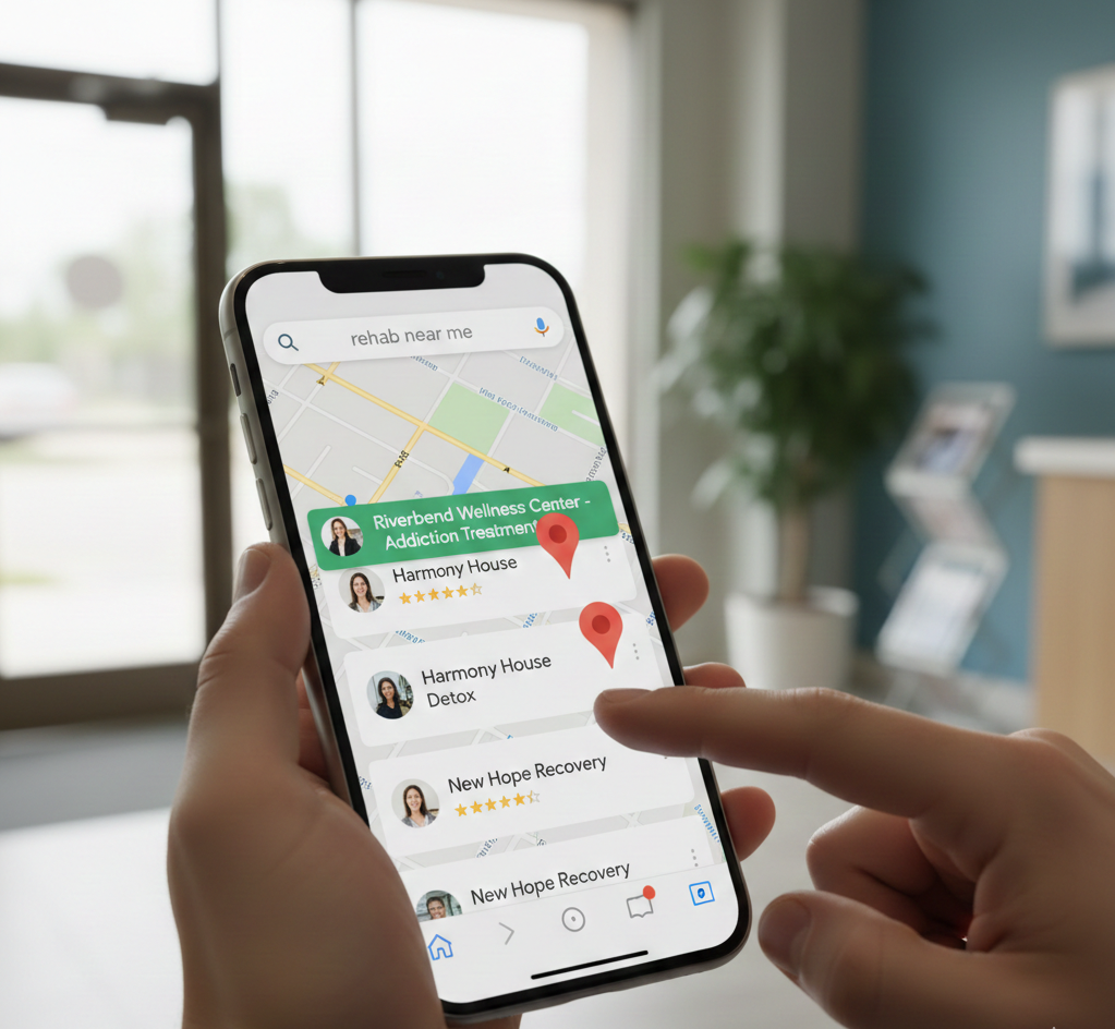
Winning the Local Search War: How to Master Google's Map Pack for Rehab Admissions
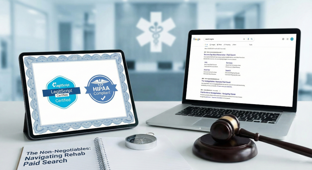
The Non-Negotiables: Navigating LegitScript and HIPAA Compliance for Drug Rehab Paid Search
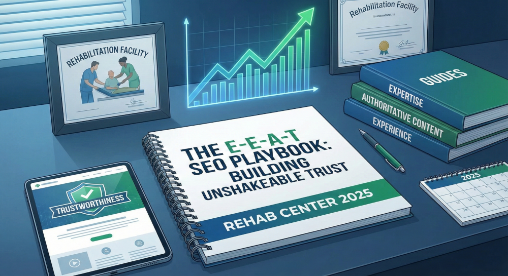
The E-E-A-T SEO Playbook: Building Unshakeable Trust for Your Rehab Center in 2025
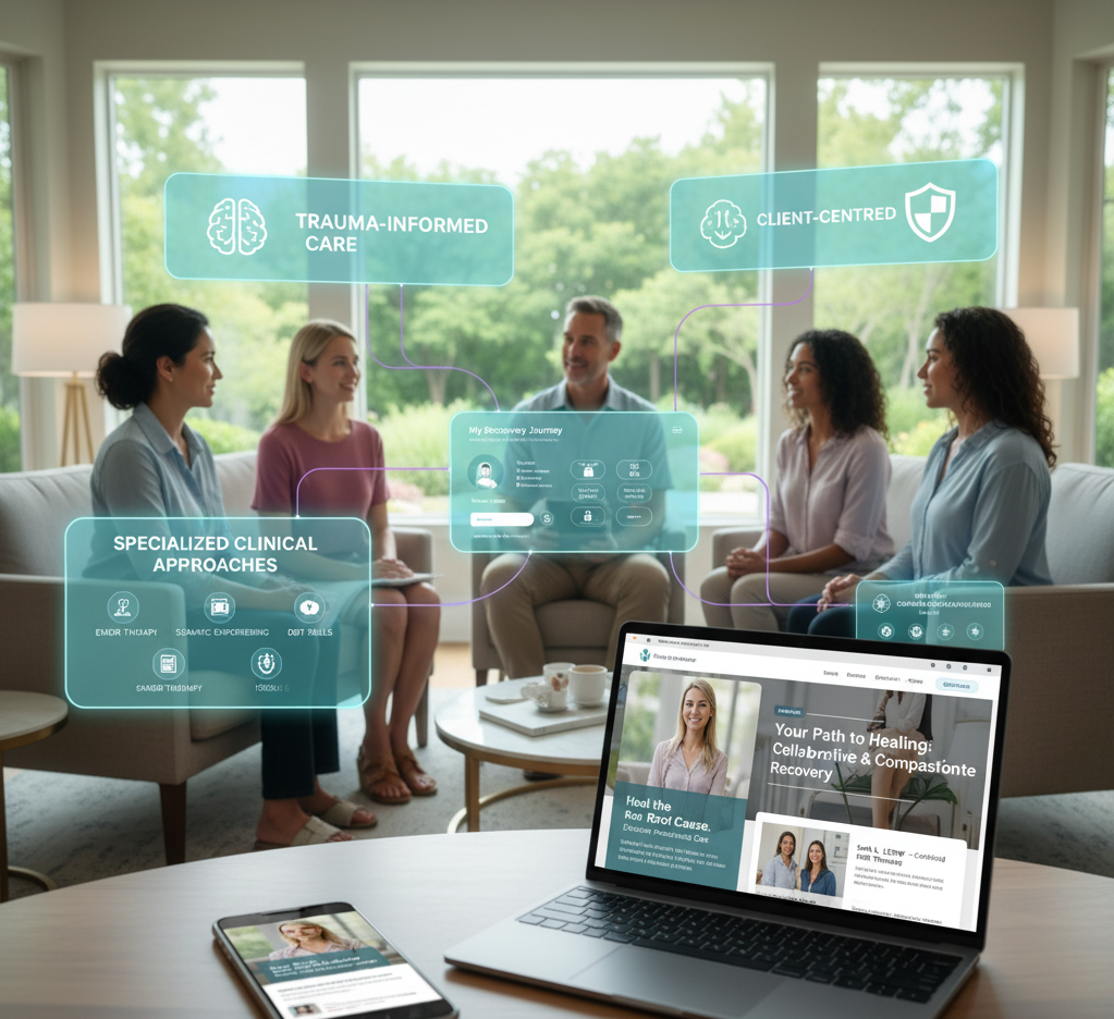
Beyond the Bed Count: Marketing Client-Centered and Trauma-Informed Care

Contact us today to get the conversation started!