
Landing pages are an important part of the sales funnel – they’re where you direct your visitors when you want them to do something – whether it’s sign up for your email list, or buy your new product. You’ll likely have several landing pages to build over the course of your career, since each landing page needs a single message and purpose.
This list of best practices is just that – a guideline to help you get started when designing your landing pages. You’ll have to experiment to learn what works best with your audience. Ultimately, your customers are in charge. Only through paying attention to analytics and split test results will you be able to fine tune something that works for them. And what works in one niche for one product won’t necessarily work for the next.
Overview
1. Colors Matter
The main call to action – more on that later – should always pop on the page so people can’t miss it. One of the easiest ways to do this is to make use of contrasting colors. Color theory plays an important role in web design in general, but especially when it comes to landing pages.
Make sure your buttons are a contrasting color to your background and surrounding text so they are easier to see. This way when you’re asking your visitors to fill out a form, they don’t have to look hard to find the submit button. With the right colors, their attention will automatically be drawn to it.
Does this mean you have to use bright and annoying colors? Not at all! If you’re using a white background on your form, any dark color will create the contrast you need to draw attention. You can still pull off a cohesive look that matches the rest of your branding without turning your landing page into a flashing billboard.
2. Don’t Waste Time
Humans have a short attention span, and that’s important to consider when it comes to landing page design. They’re not going to take the time to read every single word on the page… and you’re likely not going to read every word in this blog post. Instead, they’re going to skim and look for certain words, so they can find the information they are looking for.
People are on your landing page for a reason, so don’t waste time getting to the point. Address the reason why someone is there, clearly and succinctly highlighting the value of what you’re offering.
Use headers and sub headers to break information down into digestible chunks. Make it easy to scan and read with bullet points to explain what your visitor will get when they take you up on your offer. Place emphasis on keywords and points with bold or italic fonts, and keep things brief.
3. Include Video
Video has been shown to help boost conversions by as much as 80%. If you have a rather complex idea that would take a lot of text to describe the way you need to, then video is your best bet. That way, you can still be succinct and get straight to the point, but tell the audience everything they need to know.
4. Pay Attention to Your Messaging
The messaging you show on your landing pages (and elsewhere on your website) should be consistent with the messaging in your ads. If there is any kind of disconnect between what you’re promising in your ad and what you’re delivering on your landing page, you won’t see conversions. Don’t run ads to your home page, or any kind of generic splash page. Create visual continuity between the ad and the landing page for a seamless user experience.
5. Keep the Layout Clean
The web is becoming increasingly visual, so it’s easy to see why using extravagance on your landing pages may have some appeal. But, you’re not after something that looks pretty here; you’re after conversions. And if your layout is too cluttered, you’re going to distract your visitors from conversion. Plus, the more you have on your page, the longer it will take to load. And the longer it takes to load? The more conversions you’re going to lose. One study shows a one-second delay in page load time not only produces a 7% loss in conversions, but also results in 11% fewer page views and a 16% decrease in customer satisfaction.
If you don’t need it to support the path to conversion, get rid of it. Keep everything clean and simple.
6. Add Your Logo
You should always include your logo on your landing pages because you want your visitors to keep your brand at the top of their mind when they are downloading your content or taking advantage of any of your special offers. Obviously, the logo doesn’t need to be the front and center detail every time – and it shouldn’t be – but you want the logo there to increase brand awareness.
The simple fact is, people are going to be coming to your landing pages from non-branded sources like social media and search engines. Placing a logo somewhere on the page is critical to ensure people recognize the page as a publication from your business.
For consistency’s sake, once you’ve decided on a size and placement for your logo on your landing page, you should include it in the same place on each landing page you create.
7. Make Forms Mobile-Friendly
We all know how important a mobile-friendly website is these days since it’s been a ranking factor for a few years now. But as more people use the internet on their mobile devices than their desktop, your form should be mobile-friendly, too. I can’t tell you how many times I’ve gotten frustrated trying to fill out a form on my phone. There have been a few times I’ve gone to the computer in my office to finish the form, but I’ll be honest. Most of the time, I either can’t get to my office at that moment to finish and forget, or it just isn’t worth it to me to go to the computer. And you can bet that if people have trouble filling out your form from their phone or tablet, most of them aren’t going to take the time to go back later.
8. Include Social Proof
Social proof is worth its weight in gold. With it, you’ll gain credibility from third parties to help build trust with your audience. Reach out to clients and ask about their results to build case studies to share. Search social media for positive mentions of your brand, and embed tweets and Facebook posts into your landing page. Ask people who’ve left positive reviews or testimonials if you can quote them. Have your products or services been featured in major publications or on broadcast television? Highlight those press mentions!
9. Call to Action
Your call to action should be big in comparison to everything else on the page. It should also be positioned above the fold. Yes, some people will scroll, but not all – so make it easy for website visitors. Don’t be afraid to use directional cues like arrows or pictures of people pointing to your button to attract attention to it.
“Submit” is a pretty standard call to action. If that’s your default, start thinking about other ways you can say what you want your visitors to do. What is it that your visitors want to do? Do they want to coach their clients? Grow their website traffic? Get the best sleep of their lives? Whatever it is, try a button with the main action positioned below the phrase “I want to..”
If you’re selling a sleep product, then your CTA button could read “sleep better tonight” instead of “submit.”
Put yourself in your audience’s shoes, and think about what would motivate them the most. Structure your copy around that, and make your CTA button text match the rest of the vibe.
10. Split-Test to See What Works Best
If you think you’re going to get the perfect landing page design your first try, you’re wrong. You may get really close, but there’s always room for improvement. It’s always a good idea to conduct a series of split tests to help you see what your audience responds to the best. You can split test everything from the colors you use, to the headline, copy, and call to action, to the layout, the position of the signup form, and even the offer itself. Split testing again and again until you’ve found the best combination of elements to get you the highest possible conversion rate.
When you’re building a landing page, think about things from your customer’s point of view. The idea is to make it as simple as possible for them to get the information they need to make a decision about what to do next. The beauty of it is you can always make adjustments to improve your conversion rate.
What are you waiting for? Go build some landing pages!
2 Comments
Leave a Reply

OTHER ARTICLES YOU MIGHT BE INTERESTED IN

AI in Addiction Marketing: Leveraging Automation and Data-Driven Personalization

Beyond the 'Call Now' Ad: Using Funnel-Based Messaging to Nurture Drug Rehab PPC Leads

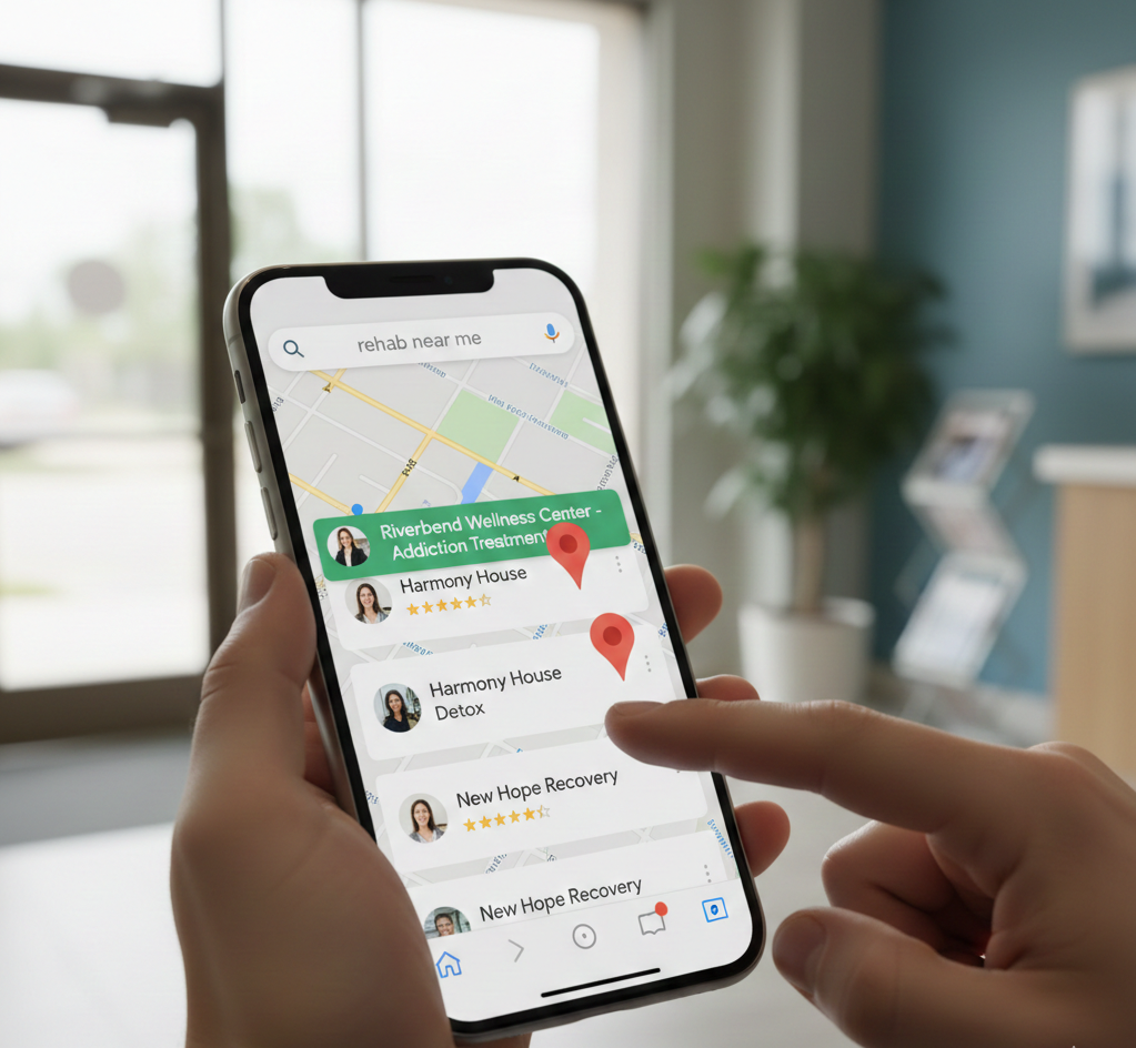
Winning the Local Search War: How to Master Google's Map Pack for Rehab Admissions
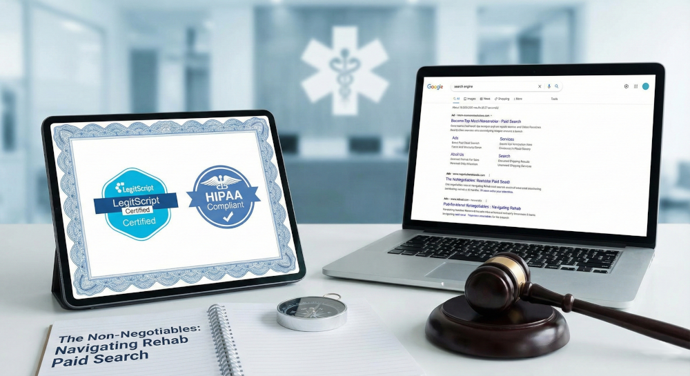
The Non-Negotiables: Navigating LegitScript and HIPAA Compliance for Drug Rehab Paid Search
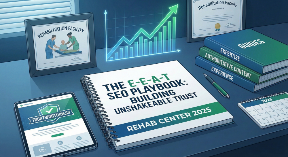
The E-E-A-T SEO Playbook: Building Unshakeable Trust for Your Rehab Center in 2025

Beyond the Bed Count: Marketing Client-Centered and Trauma-Informed Care

Contact us today to get the conversation started!
Completely agree Eric! Super clean landing pages really do help conversion rates. Great stuff man!
Thanks for reading! Glad to be of service.