Color plays an important role in marketing. Discover the power of effective color theory and web design for your digital marketing.
Color is an important aspect of web design, because it can make or break even the most well laid out websites. Color has the power to evoke emotion, which has a tremendous influence on how people view brands, and how they feel while using a website. Plus, you can use color to dictate where you want someone’s attention to go, which helps with conversions.
Overview
What is Color Theory?
Color theory is the study of color. Before I get too deep into theory and how to choose the right schemes for your website and other branded materials, let’s get some vocabulary out the way, shall we?
Primary Colors
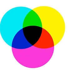
We learned what primary colors were in elementary school, but in case you need a refresher; primary colors are the three colors that form the basis for all other colors and shades. They are: red, blue, and yellow, but you may also hear them referred to as magenta, cyan, and yellow.
RGB and hex
Online, we use an RGB (red, green, blue) color scale and hex values to represent colors. It’s based on three different values: a shade of red, a shade of green, and a shade of blue.
- rgb(0, 0, 0) equals black
- rgb(255, 255, 255) equals white
With the hex system, each value is converted to a hexadecimal representation, so it becomes:
- #000000 equals black
- #FFFFFF equals white
Each color has two characters.
Complementation
This refers to how we see colors in terms of their relationship with other colors. Relationships between colors play a large role in how visually appealing a design is. I’ll talk more about complementation in the types of color schemes you can use a little later.
Contrast
This refers to how we use colors to reduce eye strain, and draw focus to certain elements on a page. Contrast is the part of color theory that has the largest impact on website usability. It describes the level of clarity between two objects on page, generally speaking the color of the text against the color of the background. Low contrast can easily look beautiful, but it’s harder to read, especially for those who have vision issues, or are using a mobile device on a bright sunny, day.
No matter how pretty it may look, never use a color scheme that sacrifices usability. The safest options are to use a dark color on a light background, or a light color on a dark background. When considering contrast, remember that 4.5% of the world suffers from some kind of color blindness, meaning choosing the wrong colors could make your website virtually unreadable for them.
Vibrancy
This refers to how we use color to influence user’s emotions, or to attract a specific target market. I’ll go more in depth about the psychology of colors in the next section of this post.
Temperature
Colors are often classified as hot or cold, warm, or cool. Warm colors are those with more reds and yellows. Cool colors are those with higher amounts of blue. If you increase the temperature of a color, you’re increasing its levels of orange – typically making the color look happier and warmer. If you reduce the temperature, you’re reducing the amount of orange in a color.
Tints and Shades
Tints come from adding white to a color, and shades come from adding black to a color. Using tints and shades allows you to create a monochrome color scheme by adding various levels of white and black to a single base color.
Hue
Hue is used to describe the degree to which a color can be described as similar to or different from any of the colors in the rainbow. So if you describe a color as bluish green, you’re defining it as it relates to two hues.
Saturation
Saturation is a term used to describe the intensity of a color. Increasing the saturation makes the color darker and richer, where decreasing the saturation makes it fade and get lighter.
Lightness
Lightness is also referred to as tone or value. It defines the perceived brightness of a color compared to white.
The Psychology of Colors
Warm Colors
- Red: This is a hot color, known for it’s ability to stimulate appetite. It is associated with love, power, and passion, but also associated with danger and anger. Beyond the Western world, it represents prosperity and happiness. It is the color for brides in many eastern cultures, and is associated with communism.
- Orange: This color is less overwhelming than red, and is associated with joy, happiness, and friendliness. Because you see it during the changing of seasons, it can be used to signify movement.
- Yellow: This color is the brightest, and often the most energizing. It is a positive color, associated with joy, sunshine, intelligence, and happiness. But, for Egyptians, it’s the color of mourning.
Cool Colors
- Green: This color bridges the gap between the warm and cool colors. It’s strongly associated with nature and healing, so it’s a highly positive color. It’s also associated with money, growth, prosperity, harmony, and the environment.
- Blue: This color is associated with dependability, stability, trust, and expertise. It’s a calming color, though the hue creates variations within its meaning. Darker tones are often used for corporate websites, where lighter tones are used for friendly and open sites like social media – think Twitter.
- Purple: This color is considered the color of royalty. Darker shades are associated with wealth, luxury, and sophistication, while lighter shades are associated with romance and spring. It has different meanings depending on where you are in the world, and is often associated with creativity, imagination, and spirituality. In Thailand, for instance, it is the color of mourning for widows.
Neutral Colors
Neutral colors are generally used for backgrounds and are accented with brighter colors to provide impact on the page. But, it’s worth noting they do have their own associations.
- Black: This color is associated with wealth, power, elegance, sophistication, and death.
- White: This color is associated with innocence, purity, freshness, and cleanliness.
- Grey: This color is associated with calmness, somberness, tradition, and conservatism.
- Brown: This color is associated with earthiness, reliability, and dependability.
Choosing Your Starting Colors
When you consider that the human eyes are capable of seeing 10 million colors, the idea of choosing just one or two becomes incredibly overwhelming, doesn’t it? But thankfully, there are a few things that can make the job a bit easier.
- Is there an existing logo? If so, that’s going to give you all the color information you need. This is, unless of course, the logo needs to be made too, as part of a rebrand.
- What colors is your competition using? Regardless of what they are, you want to eliminate them if at all possible.
- What colors do you think would resonate with your target audience? The colors for a gardening club will no doubt be much different from the colors of a funeral home. Think of who’s using the website, and the emotions you want to evoke.
- Avoiding stereotypes: If you’re designing a website for young boys, it’s easy to think of going with an all blue scheme. Nothing says that’s off limits, of course, but remember you don’t have to. Avoiding clichés can help improve your credibility.
- Use word associations: If you’re still struggling to come up with colors, write down words that you associate with the business. Then, use that lis of words to come up with colors. You’ll probably have an idea of what you could start with from there – based on what you know colors mean.
Creating a Harmonious Color Scheme
Monochrome
A monochrome color scheme uses a variety of tints, shades, and saturations of a single base color. It creates cohesiveness, but risks becoming monotonous.
Complementary
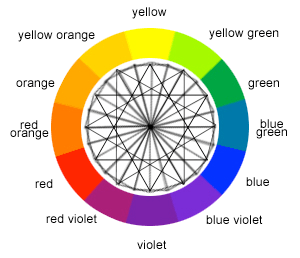
Complementary color schemes are based on two colors located on opposite sides of the color wheel. The two hues are wildly different, creating noticeable schemes with impact. No matter what your main color is, it’s a good idea to choose a complementary color for your call to action buttons, to ensure they stand out. For instance, if your main color is blue, use orange for CTAs.
Analogous
Analogous color schemes feature three colors that are next to each other on the color wheel. These will always have similarities in tone to create a cohesive scheme without risking the monotony of a monochrome scheme.
Triadic
Triadic color schemes are basic and balanced. Using the 12-step color wheel, you can select any three colors located 120 degrees from the others. Use one color for the background, and the other two for content and navigation. Triadic color schemes are diverse, but because all the colors are equidistant from each other, you have a balanced scheme.
Compound (Split Complementary)
This one is a bit tricky, but can wow your audience if it’s done well. With this approach, you choose two pairs of contrasting colors, and two pairs of complementary colors.
Tools and Resources to Help You
- ColourCode Color Palette Generator: This tool features preset modes for a variety of color schemes. You can export them in a variety of formats to share with clients or import into graphic design programs, or permalink to them.
- Color wheel by Canva – color theory and calculator
- Adobe Color CC: This tool is similar to ColourCode, but has additional features. There’s a social layer so you can see color schemes others have generated. And, there’s the ability to exact a color scheme from an image.
- ColourLovers: If you need inspiration for color schemes, this is the community to participate in.
Color Theory Matters
Think about why restaurants use red. It’s a stimulating color and has been shown to increase your appetite. Getting your colors right is imperative to connecting with your audience and getting them to act the way you want them to. The good news for you though is, you can use split testing to help you choose between color schemes – and stick with the one you know your audience responds better to.
Do you have any other tips and tricks to add on color in web design?
Contact us today to get the conversation started!


