According to an article on Search Engine Journal, Google’s testing a new design for search results – both paid and organic. The new design, which appears to be only available for certain searches and in certain locations, is likely still in the early testing phases. There’s no confirmation at this time that the changes will go live for everyone for all searches, but just in case, it’s always a good idea to stay on top of what’s happening.
The new design is similar to what we see now, but there are some subtle differences.
There are only two ads at the top of the page, where the current design has four ads. This could mean stiffer competition to get your ads to display for certain keywords.
Titles and URLS within both organic and paid search cards have been rearranged – with the URL appearing above the title instead of below. The URL is now also listed in a black color, rather than green, and there’s a lighter shade of blue in use for the title tag. There’s even a lighter gray font used in ad copy.
Additionally, there are small changes in the way the map pack is displayed, with more filters being available at the top without having to click “more filters” to get to them. Where the typical results used to read “open now” and “top rated”, we now have the addition of a “within 20 miles” filter, so people can zero in on the options that are closest to them with less tapping and scrolling.
The screenshot also shows colored dots in the upper right-hand corner of the results, which at this time, appear to do nothing more than provide a change in aesthetic appearance, perhaps better in line with the multiple colors seen in the Google logo. Each search card also now has rounded edges.
Overview
The Evolution of the Google Search Results Page
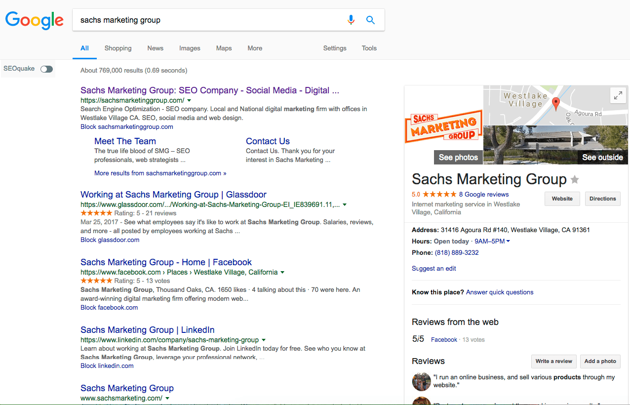
The Google search engine results pages have changed dramatically over the years. Now we have mobile ads, and native ads that blend in and don’t appear to be ads, and many other changes. Google is constantly working to keep things up to date as technology and the times change. What worked five years ago may not work today, and Google is striving to provide a consistently positive user experience for searchers. This of course isn’t really a big deal to us as searchers, but for advertisers, it can be a big deal.
Removal of Right Side Ads
As an advertiser, you’ve no doubt noticed that Google removed ads from the right side of search results on desktop devices. That space is now used to show more information about a business, including location and reviews, in the case of local searches. In non-local searches, it is used to display other information, such as shopping ads.
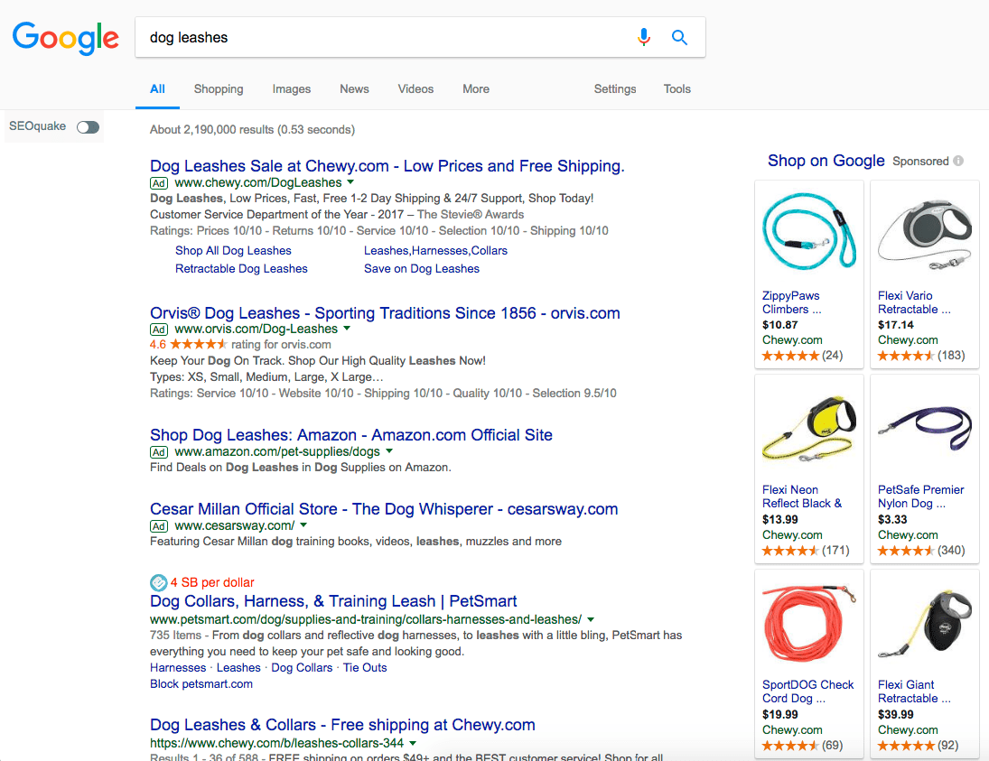
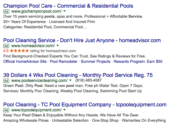
When there were ads on the right side, you had three ads on the top. And now, at least until the testing of this current adjustment goes live as a global change, there are four ads above the organic results and Google My Business listings.
In the past, Google commented on the fourth ad placement, saying: “We’ve been testing this layout for a long time, so some people might see it on a very small number of commercial queries. We’ll continue to make tweaks, but this is designed for highly commercial queries where the layout is able to provide more relevant results for people searching and better performance for advertisers.”
Those “highly commercial queries” are those with intent to purchase. The fourth placement only shows on those kinds of queries, generally speaking. Under the new design, only two can be seen. However, the query in the test wasn’t a highly commercial query, and since the new design isn’t widely available, we were unable to duplicate it using the “adwords audit” query presented in the SEJ article. We still see the current results page, which includes four ads at the top.
Addition of Map Pack in Local Searches
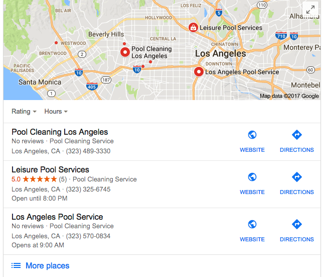
Local searches also now bring the Map Pack, where local businesses are listed for the appropriate local searches. This makes it easier for people who are mobile to contact local businesses offering the services they are looking for.
Making Desktop and Mobile Search Look More Uniform
To create a more cohesive cross-device experience, Google has made changes to ensure the search results pages look generally the same from desktop to mobile devices. Compare the screenshots from above to the one below. It was taken from the mobile version of Chrome. Though the testing version of results didn’t show up in this query, you can still see that the results look close to the same as they do on desktop.
With this approach, we have four paid search ads at the top, three in the map pack below those paid ads, and then the organic results, followed by three more ads at the bottom.
Because Google has consistently seen a larger portion of their traffic come from mobile devices compared to desktops, they’ve put more of a focus on the mobile results of course. But, because a consistent user experience is necessary, it became more important to make the desktop look more like mobile, rather than insisting that mobile results pages be shifted to look more like the desktop.
This means we could see similar changes come in the desktop searches, should Google’s testing results determine that the changes in search cards we’re currently seeing become a “permanent” change. I say “permanent” because even if this change becomes mainstream and stays in place for years, there are always market changes that could mandate the testing of a new design like we’re seeing right now.
Could the Changes Impact Organic Search Click Through Rates?
Any time there are changes in the search engine results page layout, it means there could be changes in click through rate, and changes in your positioning. There’s no guarantee that everything will stay the same as it was – meaning you could see less traffic, either as a result of a lower click through rate, a change in rank, or both. Paid ads are taking up more organic real estate, meaning the organic search results are appearing further down on the page – though this could be alleviated slightly if the ads go from four to two – meaning people are more likely to click the paid stuff than they are organic.
Ultimately, this means marketers and SEO experts have their work cut out for them, and will have to work harder to make sure their audience finds them. It won’t make it impossible, but it means making adjustments in strategy, especially in the case of local businesses.
What to Do if You Notice Changes in Rank
If you notice changes in rank, don’t panic. It just means you need to make adjustments to your SEO strategy to counter the changes on the results pages. And if these tests become the new way Google displays, then you’ll want to make adjustments accordingly. You can do things to restore your rank, though it may take time to see the results. You’ve been competing with ads and the map pack for a while now, so this isn’t really anything new.
I know the changes seem like a pain to deal with, but from Google’s point of view, they are all about serving their customers better. And that’s what your business is about, too. Google cares less about the advertiser making sure their business is found, and cares more about providing searchers with valuable results that matter to them.
Have you managed to catch the change on any of your mobile searches? Tell me in the comments below.
Contact us today to get the conversation started!


